New Paragraph
rick’s picks
case study
branding
advertising
social media
package design
collateral design
branding the o.g. artisan pickle brand to stand the test of time.
in the summer of 2010, the watsons were named agency of record for the artisanal pickling brand, rick’s picks. we first got to know the brand as customers, having discovered them on the shelves of another client, whole foods market. let’s just say, it was love at first bite. but things got really interesting when we met the charming founder of the brand, rick field. a man with a vision who needed an agency with a plan.
a fine design for a bodacious brine.
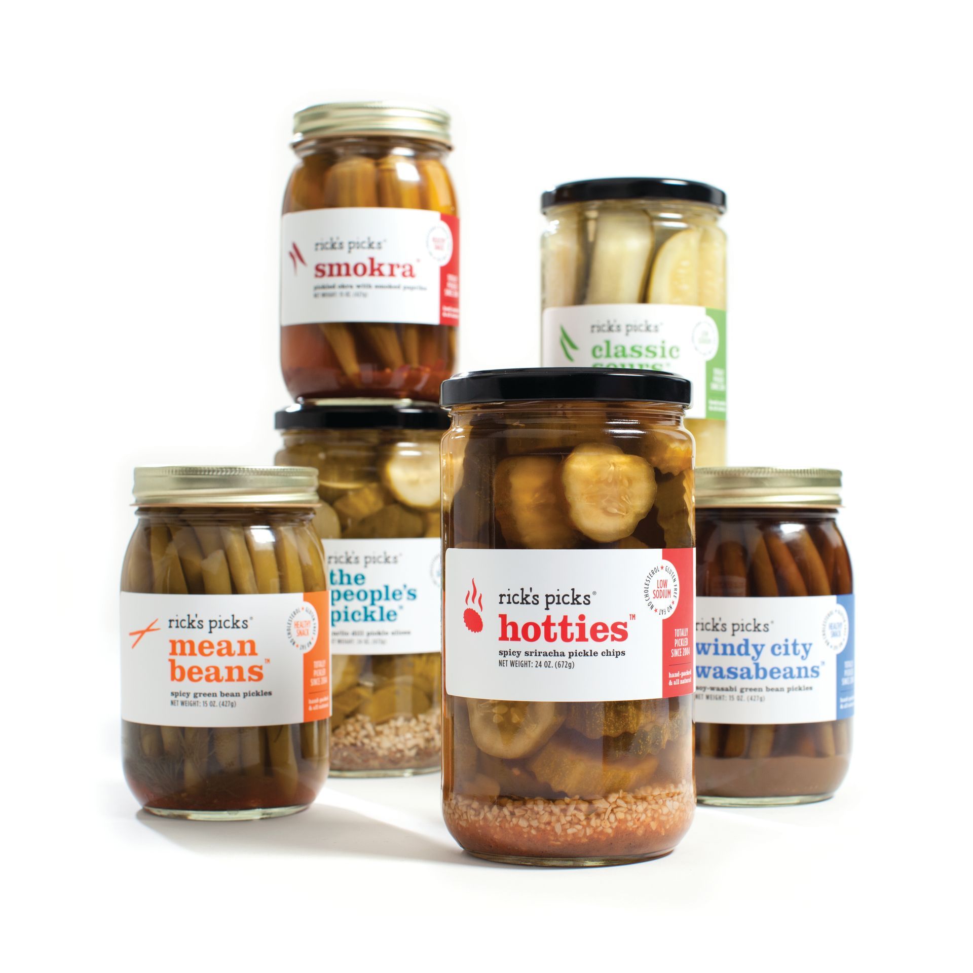
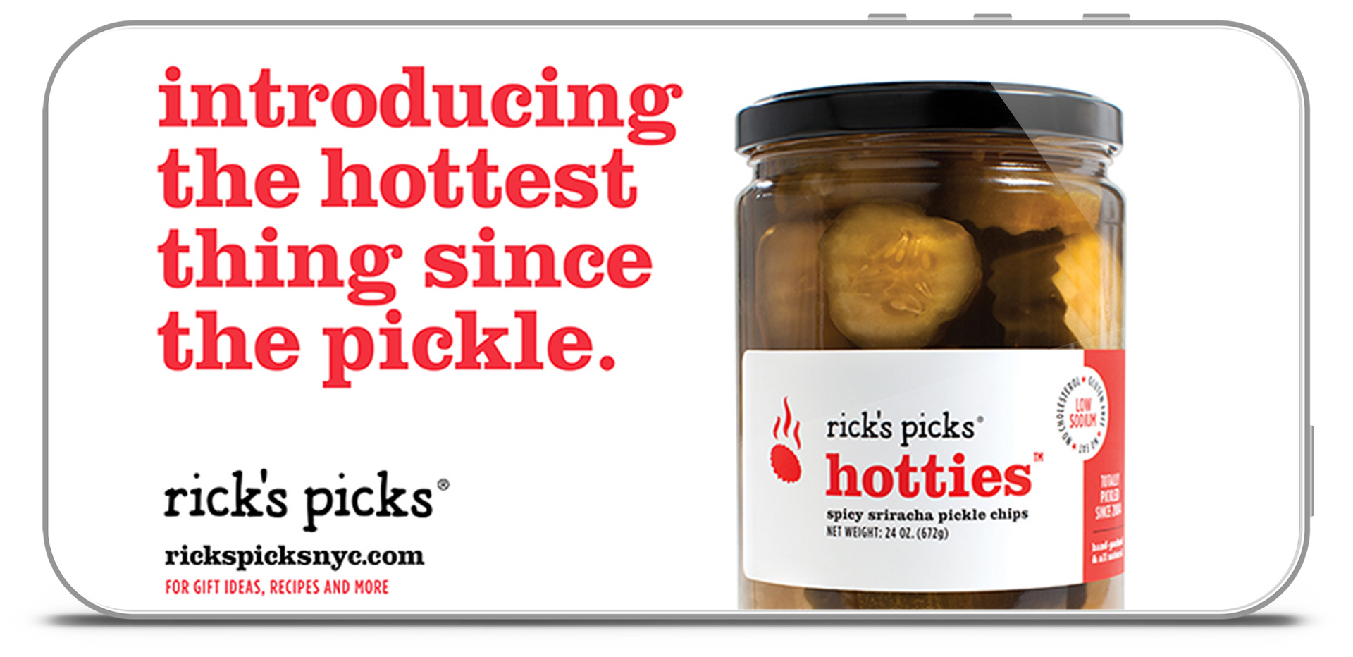
when rick and co. asked us to refresh the brand under one well-designed roof, that’s exactly what we did. with a new label design that brought to market a restrained, retro-modern take that showcased the vibrant authenticity of the brand. by highlighting their beloved icons alongside their health benefits, we were able to give a vibrantly refreshed look to each and every pickled delight.
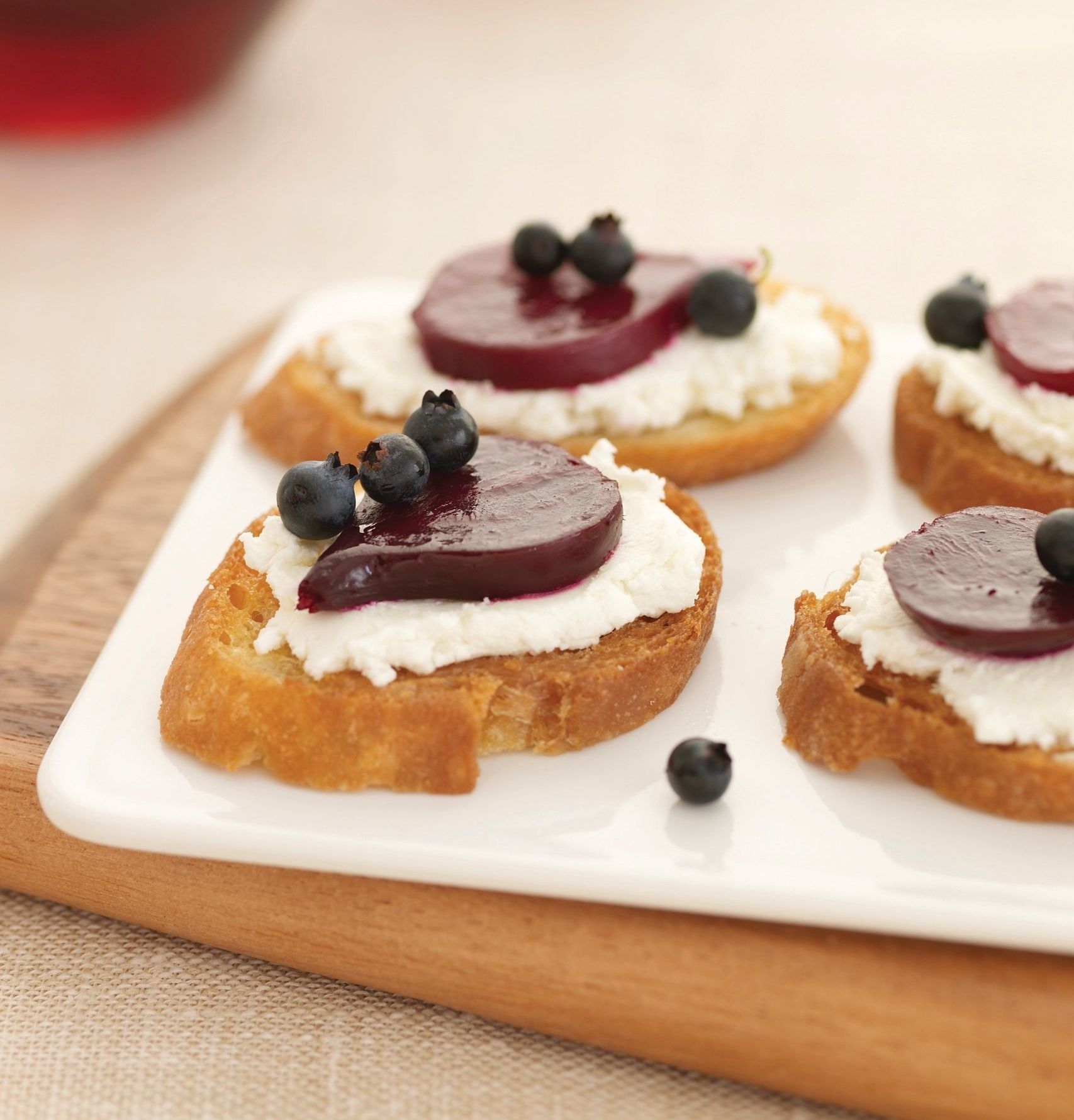
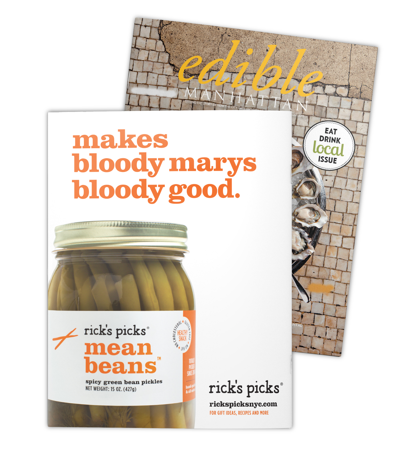
each label reflects the unique personality and flavor profile of of its pickled product. we also added fun factoids to the ingredients, like pairing phat beets with goat cheese and crackers, brining your brisket with smokra, or, a favorite, using the hotties brine to make one bloody good bloody mary. customers now know that what’s inside a rick’s picks jar is good to the last drop—a brand insight that inspired the new tagline:
what pickle people pick.
Add your title here
This is the text area for this paragraph. To change it, simply click and start typing.
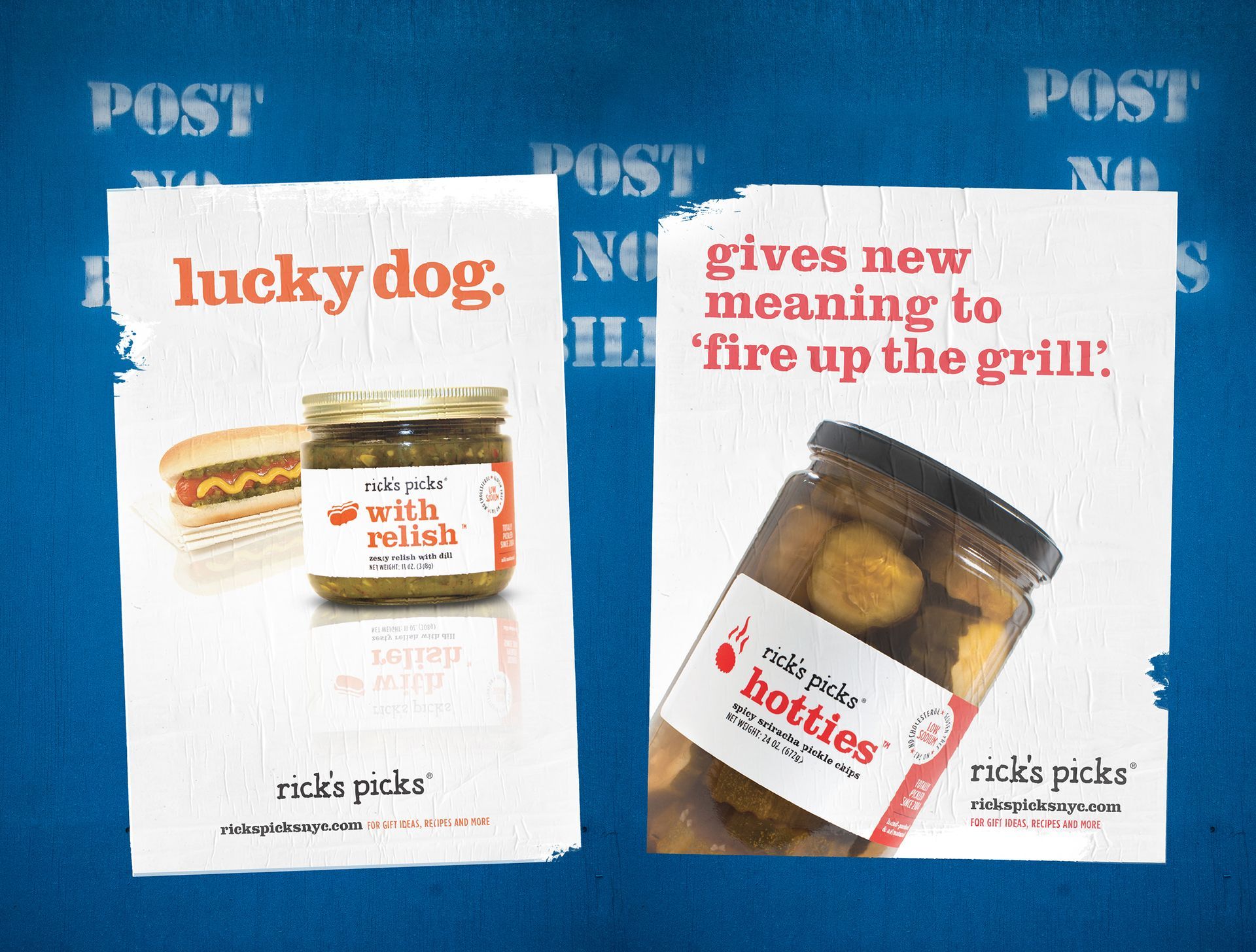
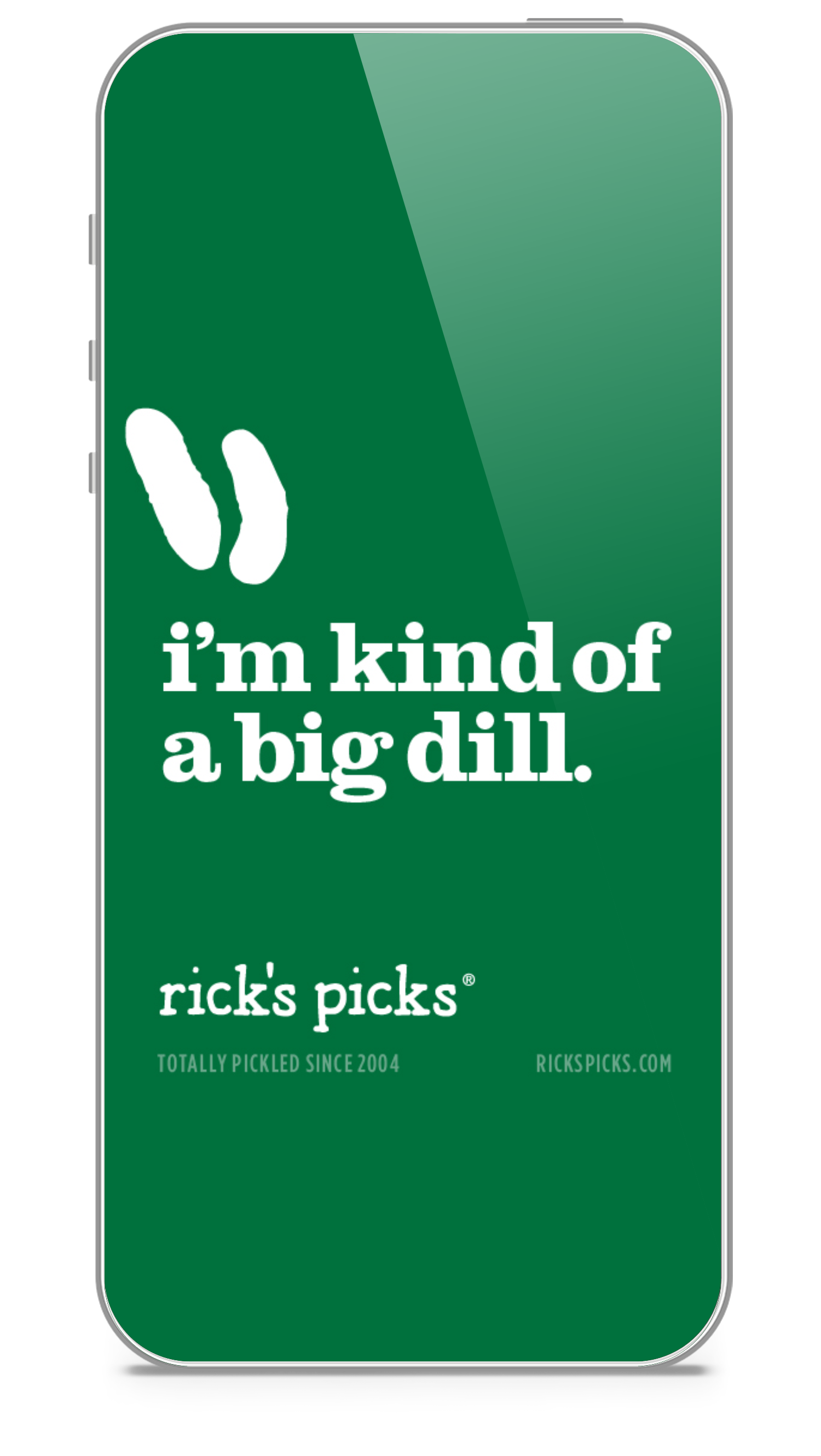
we established a brand voice as playful as the products—and the founder himself. and we developed a suite of collateral, print, and digital advertising that reminded audiences of the simple pleasures that come from fresh ingredients transformed into something unforgettable.
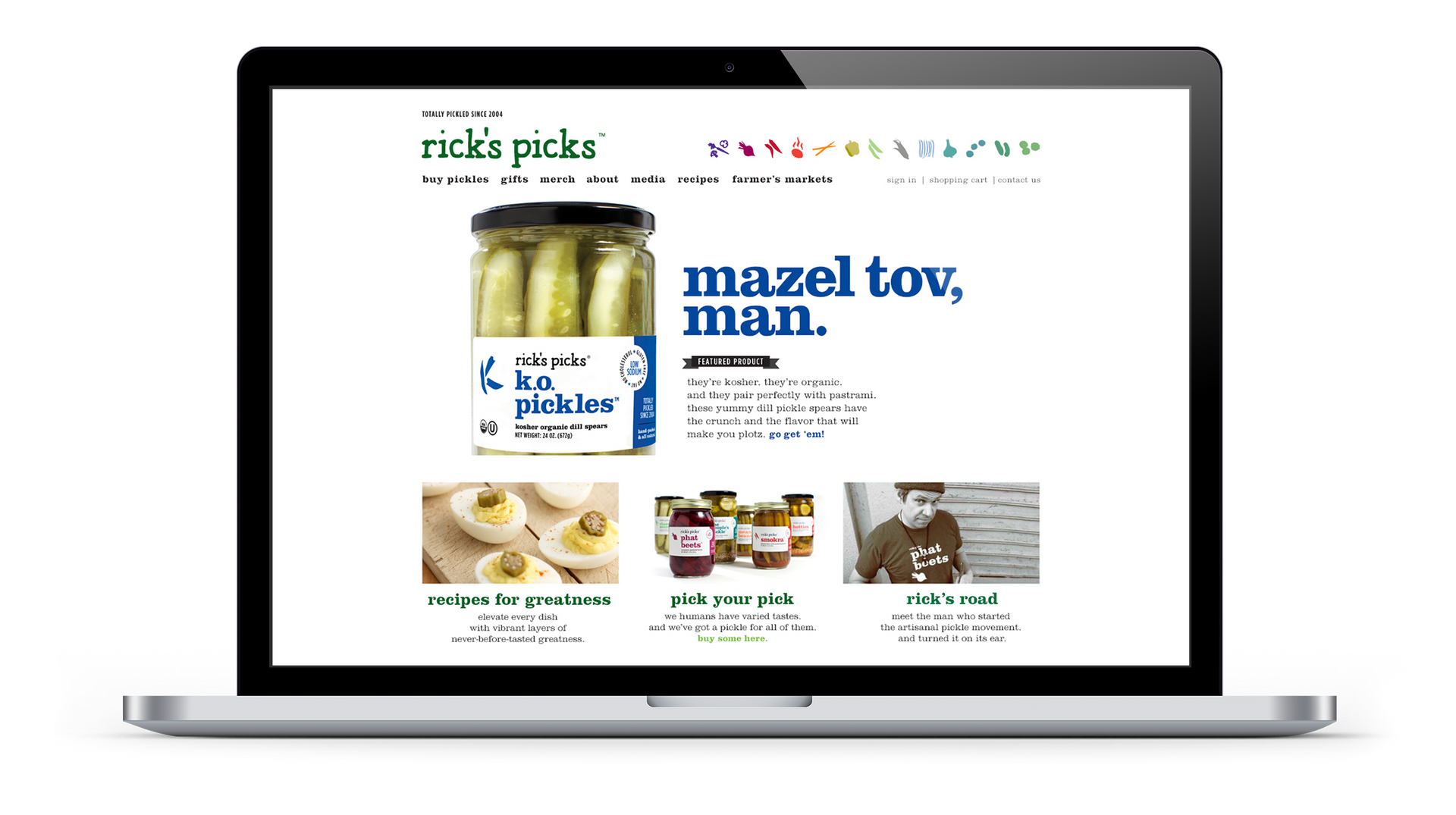
we also took over the brand’s social extensions, building affinities through shareable art, recipes, fun facts, and tips. we re-designed the brand’s booth for the fancy food show (among others), designed a branded skin for their delivery vehicle, helped make rick’s merch even more purchase-worthy, and designed reusable bags that served as an homage to local produce and the fine state of new york.
a campaign that puts brine on the brain.
Add your title here
This is the text area for this paragraph. To change it, simply click and start typing.
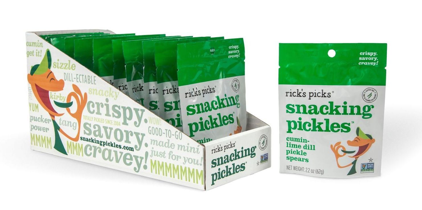
people love pickles. people love healthy snacks. and people are positively passionate about rick’s picks snacking pickles, for which we developed the package design—and all of the ensuing branding. at the heart of it all is a happy little pickle-snacker named, kirby. illustrated in-house, kirby is a fun, mod ‘brined’ ambassador who’s loved by demos boomer to z. and kirby looks swell on swag, like t-shirts, stickers, beer koozies, and baseball hats. our branding work also included the tagline—‘crispy. savory. cravey.’—as well as collateral, a landing page, and social assets.
a cravey new snacking pickles brand.