Grand Central
Terminal
case study
branding
identity
advertising
social media
video production
web development
event marketing
what trains? branding the storied Terminal as the ultimate dining & shopping destination.
when we were named agency of record for Grand Central Terminal in 2012, it was the beginning of a beautiful partnership. what could be better than using our watson wattage to shine a light on the 60 shops and 35 dining options that make the terminal a favorite destination? for us, in the grand scheme of things, it was the grandest.
a new logo design for a century-old NYC landmark.
when the fine folks at Grand Central asked us to design a new logo, we created an elegant blend of classic and modern—much like the terminal itself. an exploration of the original architecture led us to a mark that had been part of the building since its opening in 1913.
the circular marble relief was a monogram with the letters “g”, “c”, and “t”. so, we artfully transformed it into the elegant, new monogram—one that organically translates to a digital version. and in an ‘easter egg’ nod to Grand Central’s railroad history—enthusiasts will notice that the spike in the letter “g” echoes the shape of a train spike used along the tracks.
the new logo font was inspired by engravers fonts popularized in the early 20th century. its simple, all-capital forms reference that period, while the sans serif typeface imbues a sense of modernity.
we also created a launch animation for social media that
revealed the logo and spoke to its historic inspiration.

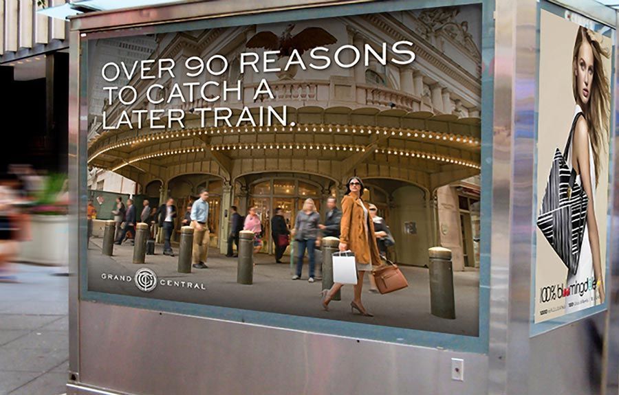
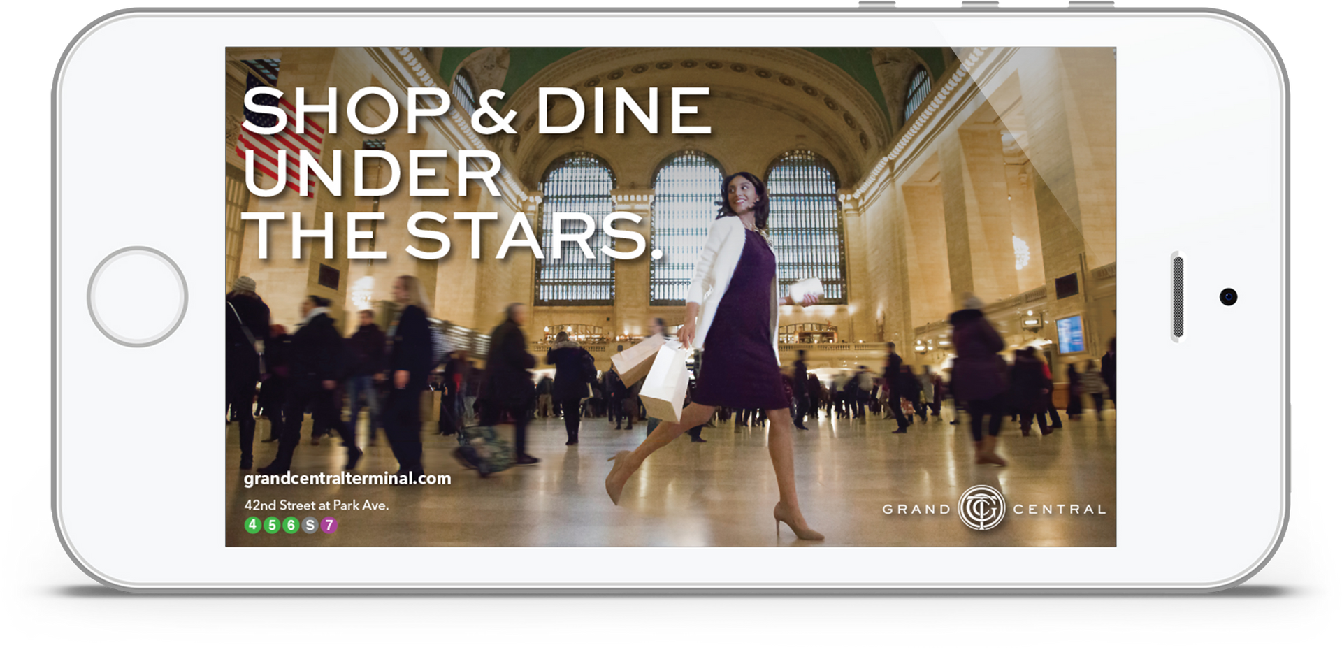
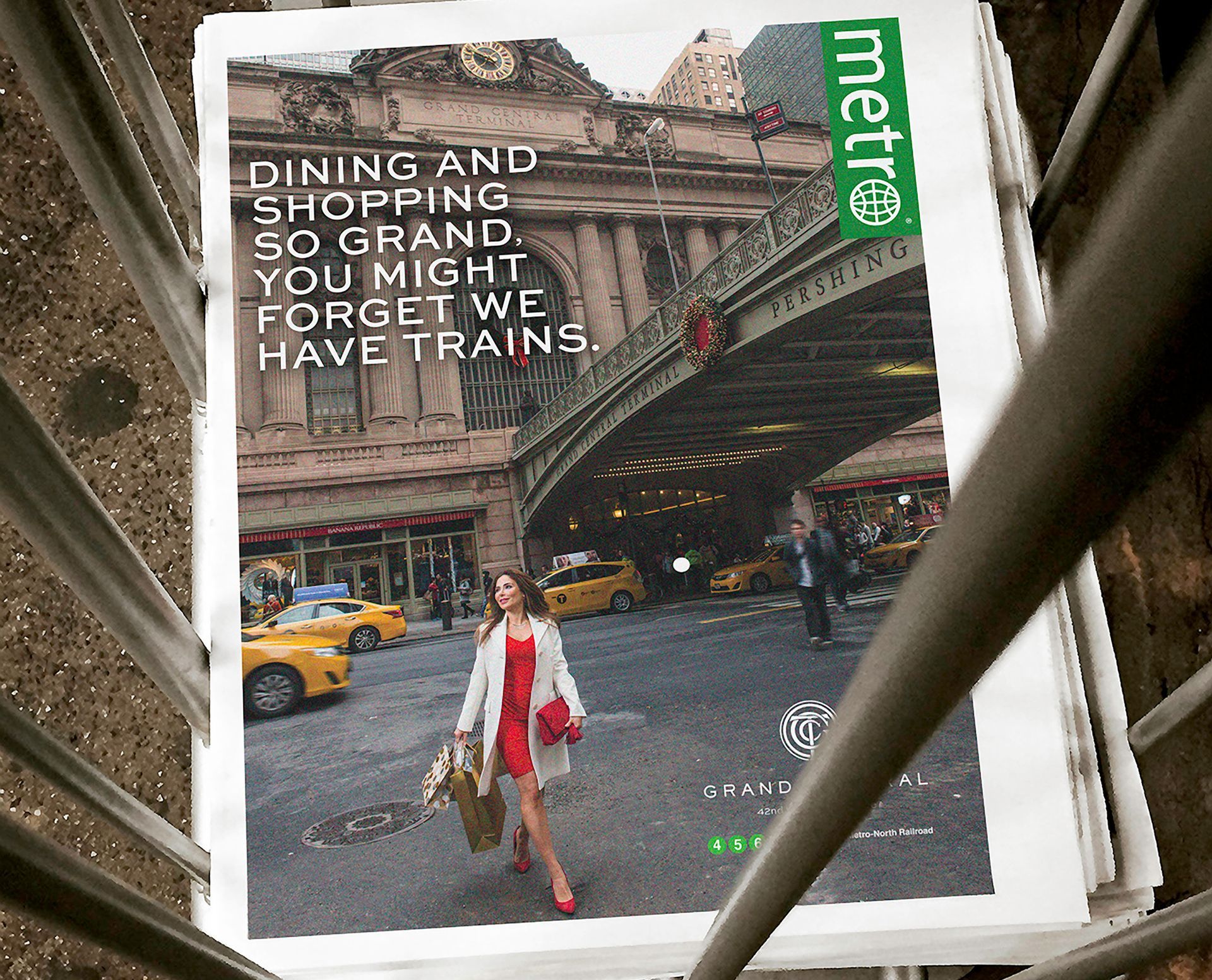
for the ad campaign, we featured models enjoying all of the edible and shop-able reasons why locals and tourists come to GCT — from Shake Shack to Grand Central Market and Vineyard Vines to Tumi. the takeaway? you can shop and dine anywhere—but there's no place more magical, sophisticated, and classicly-NYC than Grand Central. the campaign ran on city kiosks, station and interior posters, metro wraps, Time Out New York, and social and digital media.
selling chic retail, fab dining & stellar views.
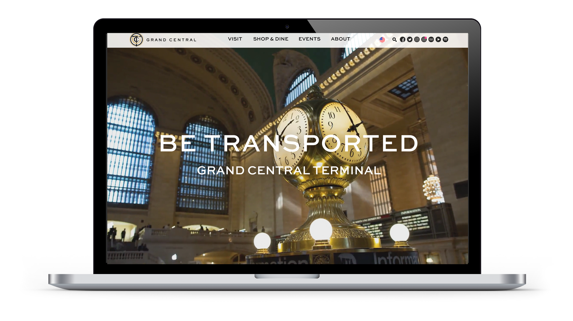
we also redesigned GCT's website to be in line with the new brand design aesthetic. we used wall-to-wall video to give the user an immersive experience — almost like walking through the Terminal itself.
a website worthy of an architectural masterpiece.
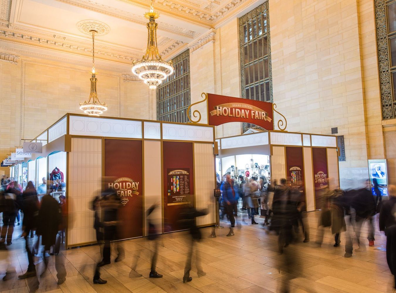
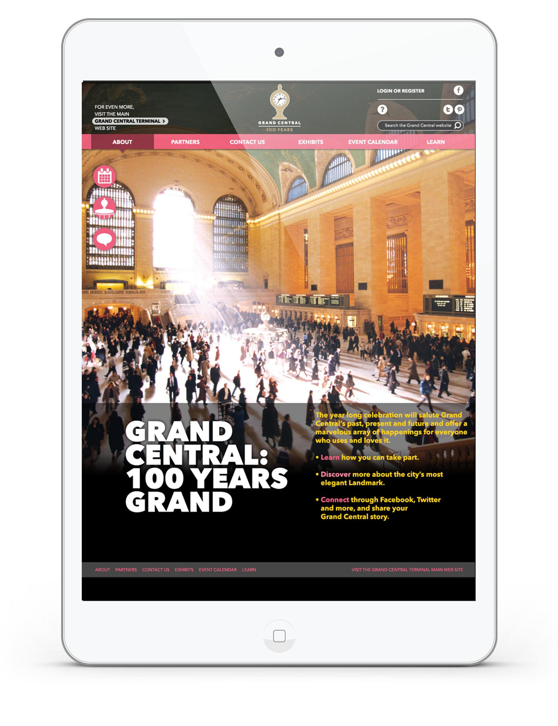
though some would argue that every day is an event at Grand Central, there are some special occasions that bring in the masses and create traditions for families and friends alike. whether it’s a centennial celebration marking Grand Central’s milestones, or the annual holiday fair, film festival, taste of the terminal, or summer sendoff — there really is something for everyone all year round.
branding grand events & holidays.
we also created animated social media assets to support the Terminal's retailers. these engaging videos featured offerings from GCT's shops and restaurants that aligned with holidays like Valentine's Day, Passover, National Cocktail Day, and many more.
telling the stories of history, secrets and celeb chefs.
there’s no better way to bring Grand Central to the masses than through the power of film. the watsons created a number of video series that give audiences an inside look at the people and places that make this an unrivaled destination. from chef portraits to tours of Grand Central’s best kept secrets to humorous vignettes, they’re the next best thing to being there.
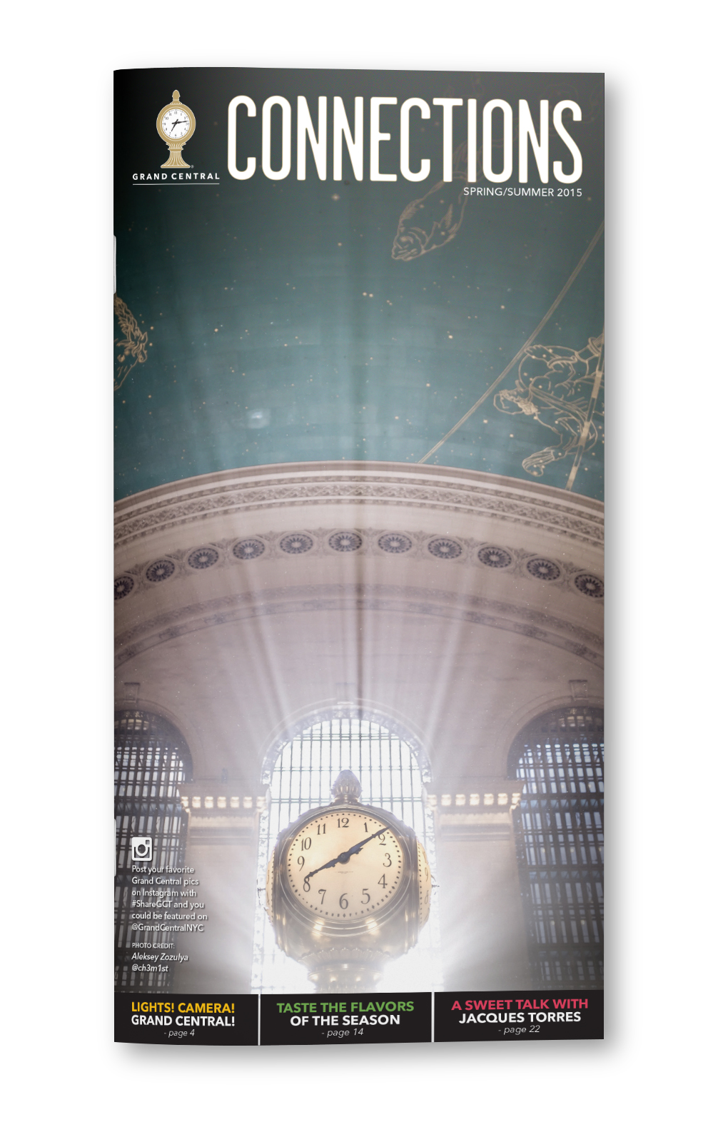
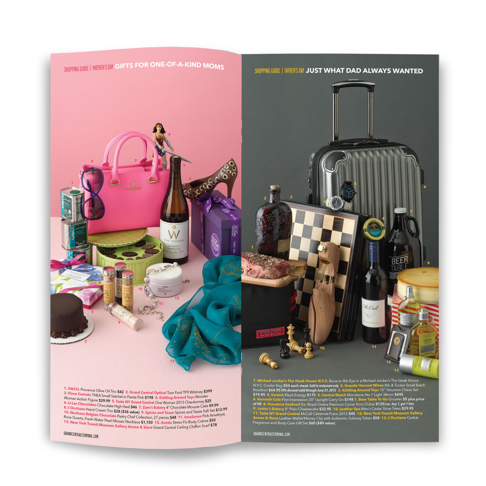
we also redesigned GCT's bi-annual publication 'Connections' which features articles about the Terminal and its dining and shopping, and featured watsons-directed gift guides for various holidays or seasons. we gave the magazine a modern editorial look to highlight the chic retailers and restaurants of the Terminal.
