Billie Jean King
Enterprises
case study
branding
identity & collateral design
what becomes a legend most? a full branding suite for BJK Enterprises.
it’s not often an agency has the opportunity to create work for an icon in the fight for equality and inclusion. happily, we watsons were fortunate enough to do just that.
rebranding
Billie Jean King Enterprises
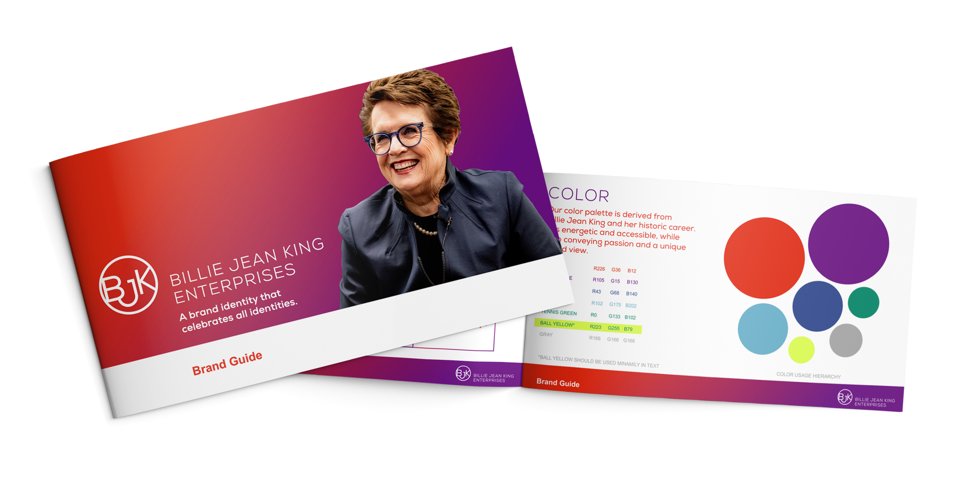
founded by Billie Jean King and Ilana Kloss, Billie Jean King Enterprises (BJKE) is a data-driven, people-focused consulting, marketing and investment firm entering a new chapter of growth and expansion. the rebrand was kicked off with a logo representing this progress, along with the organization’s mission and value statements.
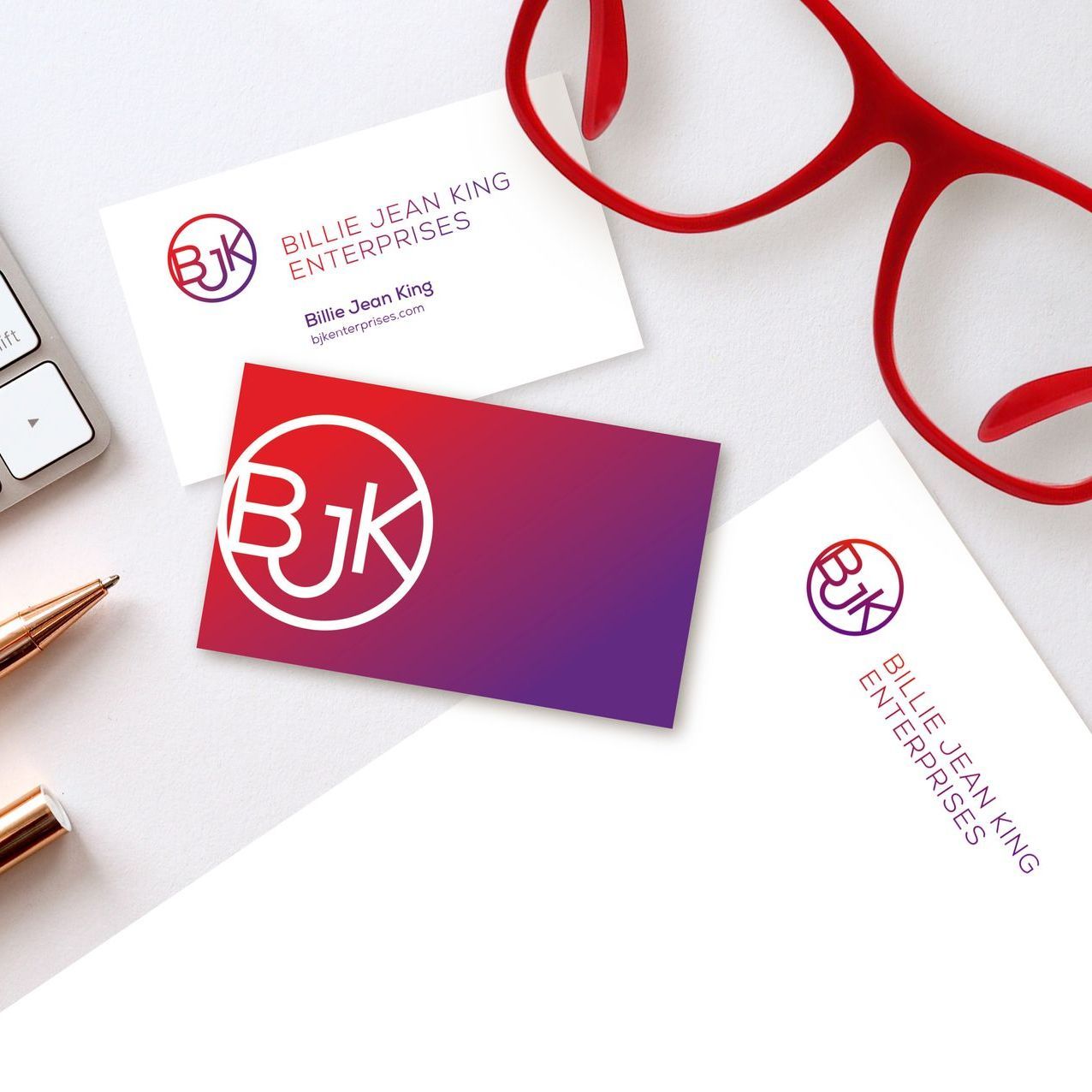
in developing a corporate identity, we began with a positioning statement, brand voice description, and logo design. the gradation of color evokes the transformation, change, and enlightenment that BJKE brings to their clients — and that Billie Jean and Ilana have brought to the world. the conjoined letters represent their partnerships and client synergies and their non-gender specific palette speaks to the role that inclusion plays in their services.

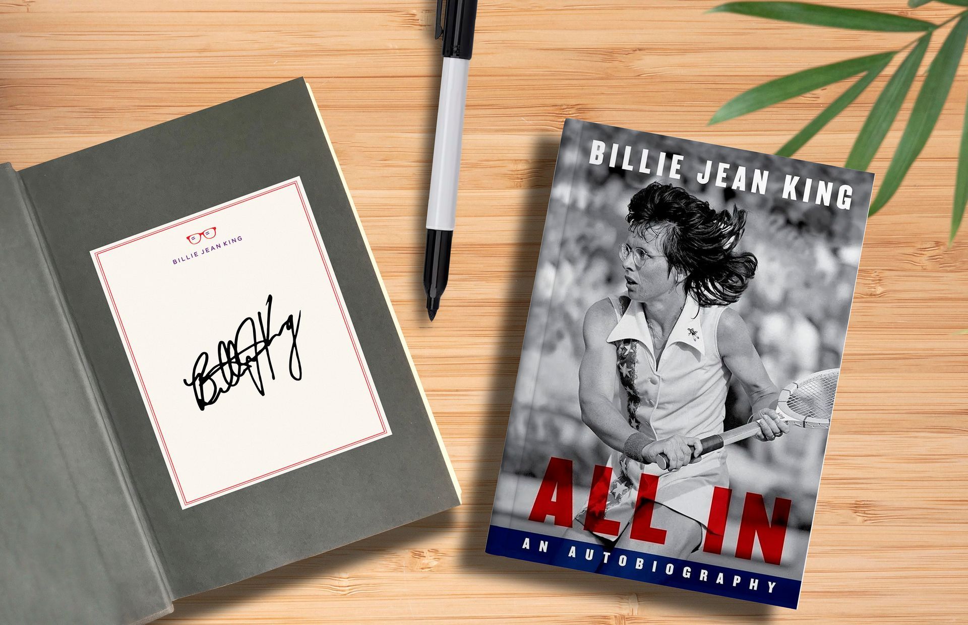
we felt like we won wimbledon ourselves when we heard that BJK loved one of our alternate logo design options so much, she asked for it to be used as her personal brand mark! for this logo, we created an icon to bring to mind both tennis and BJKs social activism: her iconic eyewear. the glasses represent her vision, foresight, and creativity; the glare marks reference the equality symbol—and ms. king’s lifelong quest for equality for all.
in another are-we-dreaming moment, we were engaged yet again by BJK and her team to rebrand the BJK Leadership Initiative to the newly-named Billie Jean King Foundation (BJKF). the Foundation, a grant making institution, supports sports as a pathway to opportunity, as well as education and on-the-ground activism. the same type of activism that's defined the life and work of the tennis and humanitarian legend. the logo's mark signifies the velocity of progress that BJK and the Foundation have made for equality in the world — and references a speeding tennis ball.