Physique 57
case study
branding
collateral design
advertising
social media
video production
an iconic luxury fitness brand gets a fierce makeover.
the watsons were named agency of record for this amazing barre-fitness brand that celebrated bad-ass women—long before it was a thing.
the watsons were asked to rebrand physique 57, a boutique barre-based fitness company, with studios in new york city, the hamptons, beverly hills, bangkok, and dubai. their best-in-class instructors teach a unique blend of barre-based exercises with intervals of cardio, strength training, stretching, and recovery. while the service offering was being widely and enthusiastically embraced, the brand look and voice needed to better reflect its strengths.
we began with a full re-design, complete with a brand identity toolkit. for the logo, we updated the fonts and color palette to a more contemporary look. while we maintained the spirit of their brand colors, we softened them to make the takeaway more upscale. and to give the logo a more ‘of-the-moment’ editorial feel, we introduced a modern san serif front and juxtaposed it with a contemporary serif font.
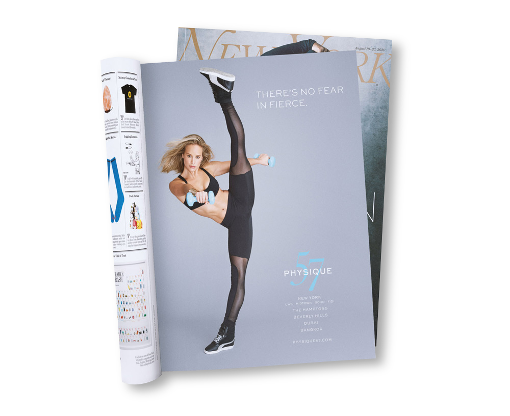
we then developed an integrated campaign that showcased the fierceness that embodied the instructors — and clients — of this unique urban brand.
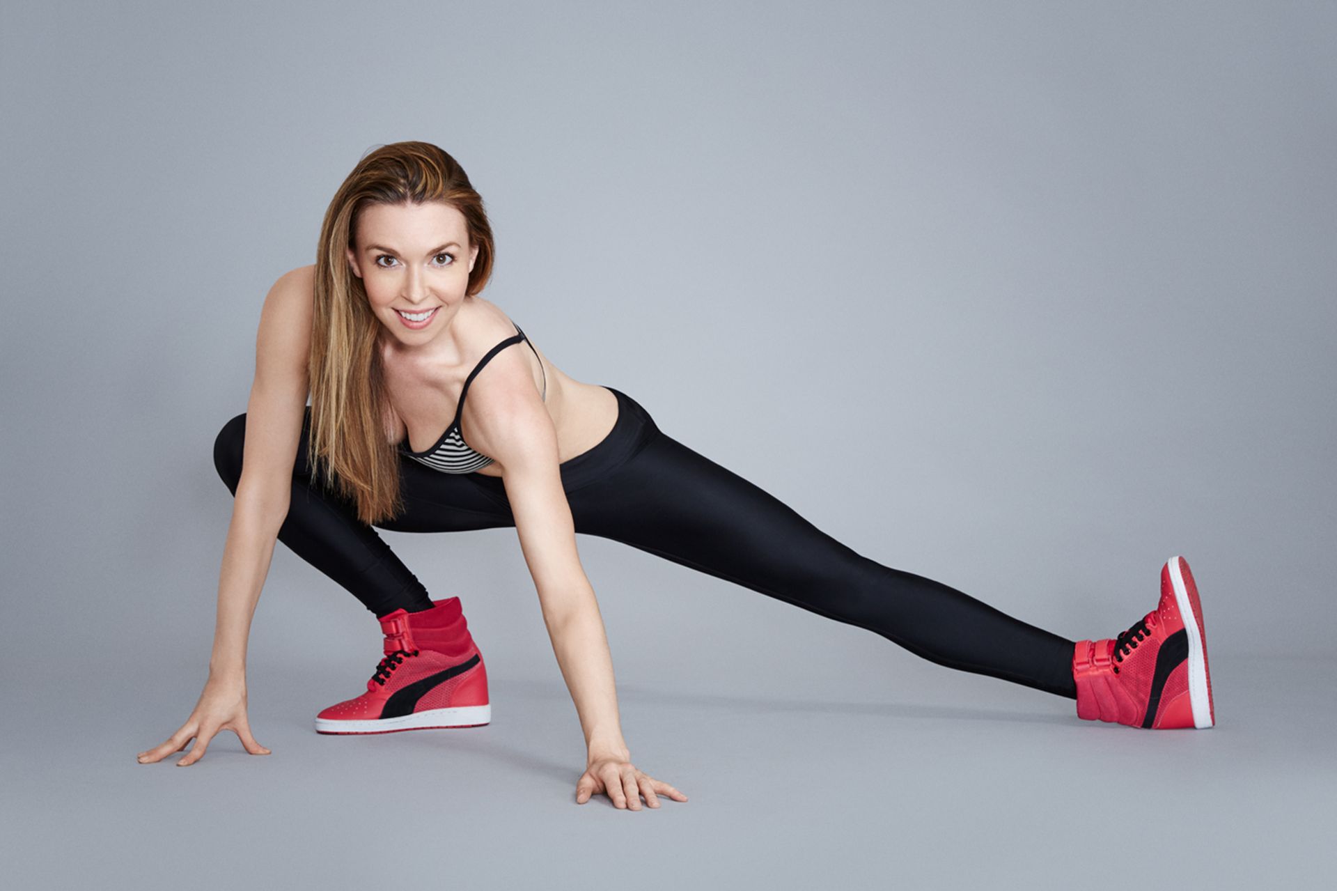
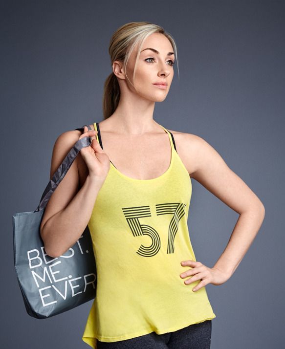
we shot portraits of physique 57’s long-term, passionate (a.k.a. ‘addicted’) clients and instructors, among them, fashion designer norma kamali. these portraits were styled in a fashion-meets-fitness way to focus on the results that make Physique 57 a go-to class for celebs and New Yorkers alike. and to show the full spectrum of the brand experience, we also shot classes in action in an authentic reportage style in the visually stunning baryshnikov arts center.
the new look was clean, elegant, and urban, reflecting the energy and attitude of the city itself. with a voice as empowering as the brand experience, we created an aspirational, representation of the powerful women at the helm — and heart — of physique 57.
fitness meets fashion brand.
Add your title here
This is the text area for this paragraph. To change it, simply click and start typing.
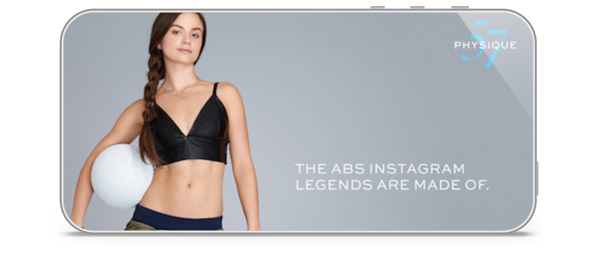
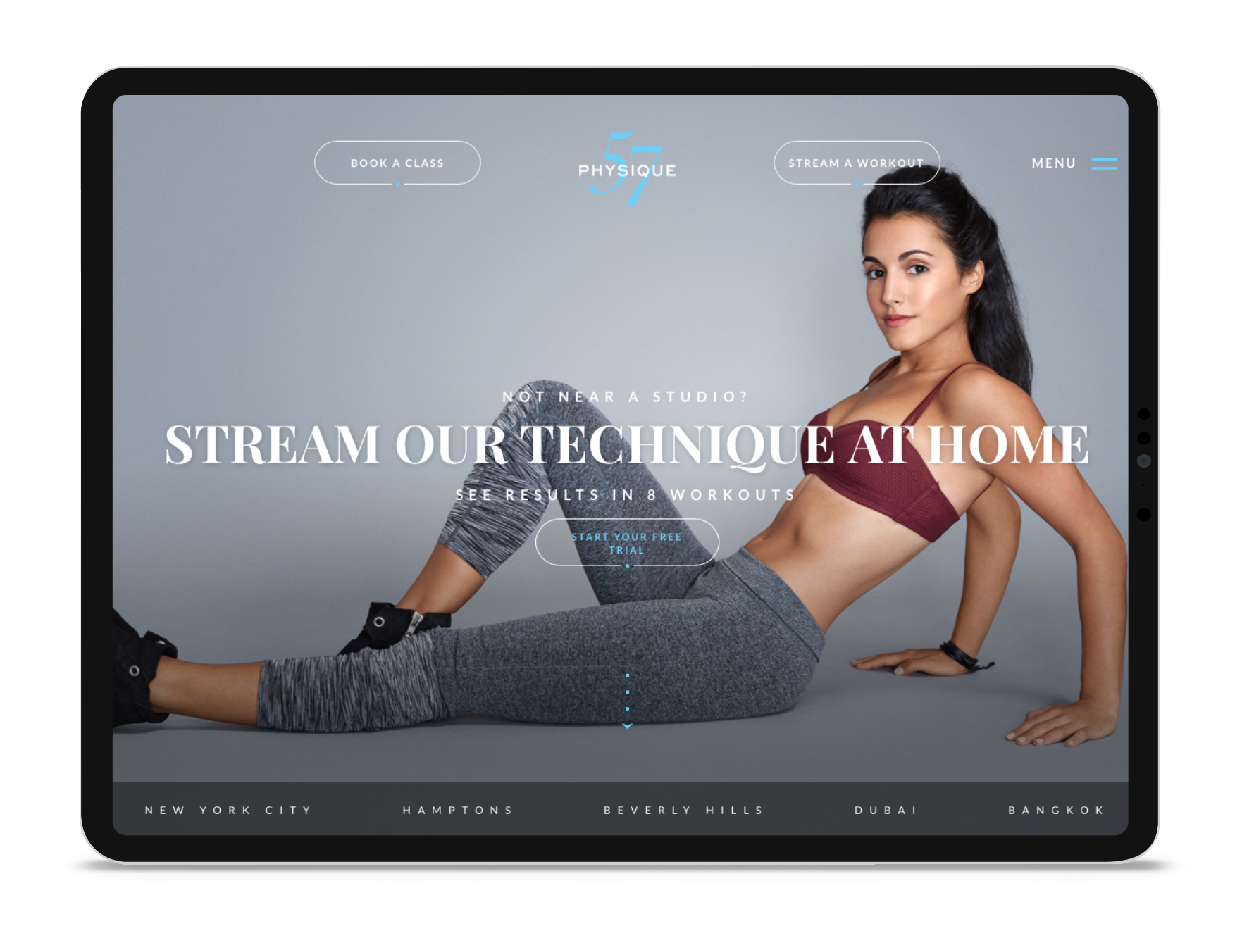
our media strategy included digital display, paid social, print, sidewalk stencils, and ooh. we also provided new branded assets and direction for their website.
Add your title here
This is the text area for this paragraph. To change it, simply click and start typing.

Add your title here
This is the text area for this paragraph. To change it, simply click and start typing.
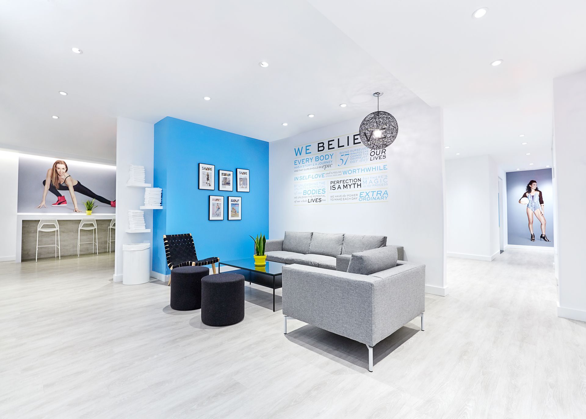
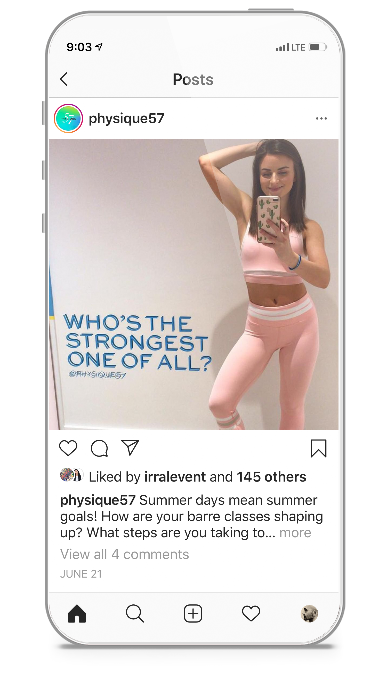
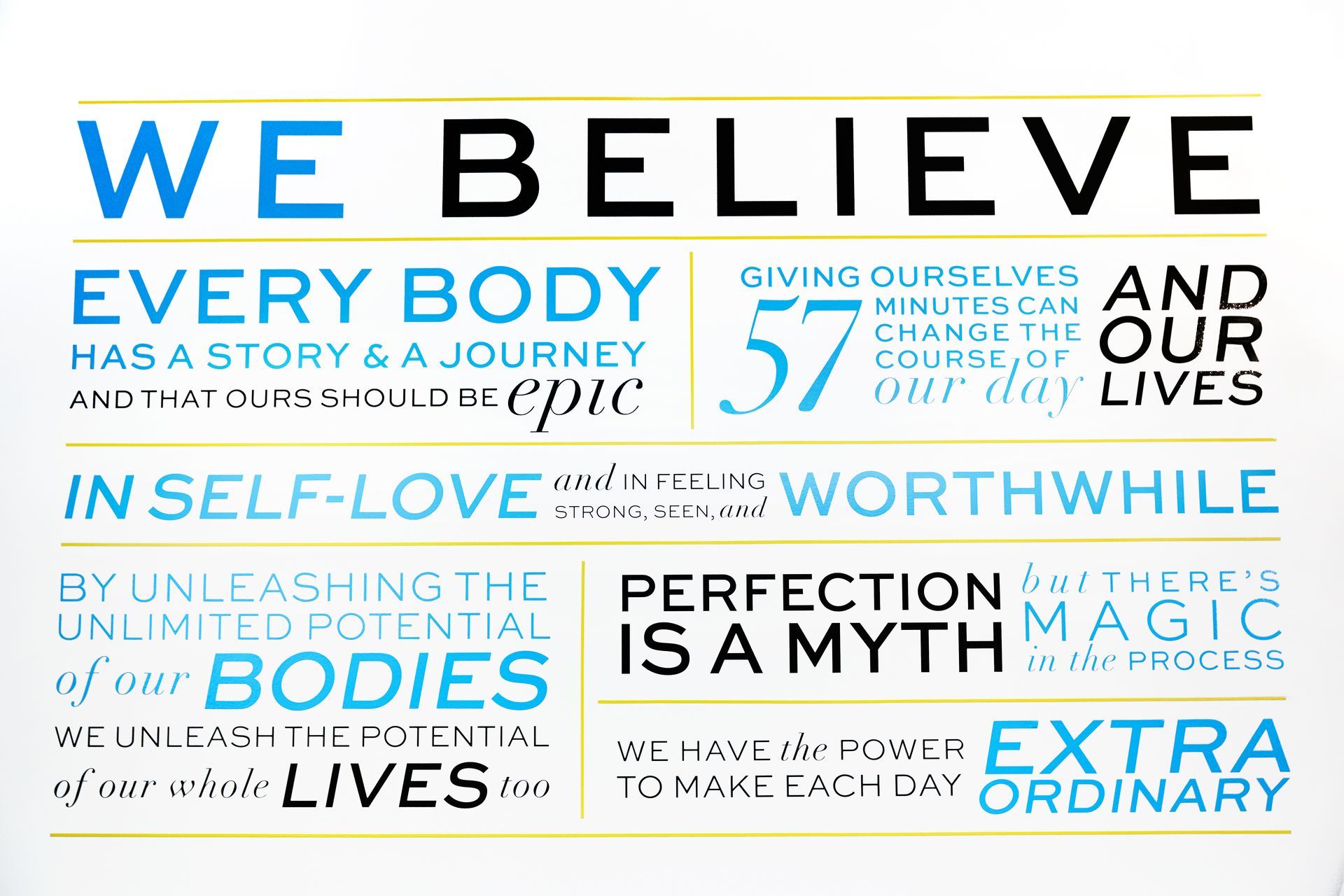
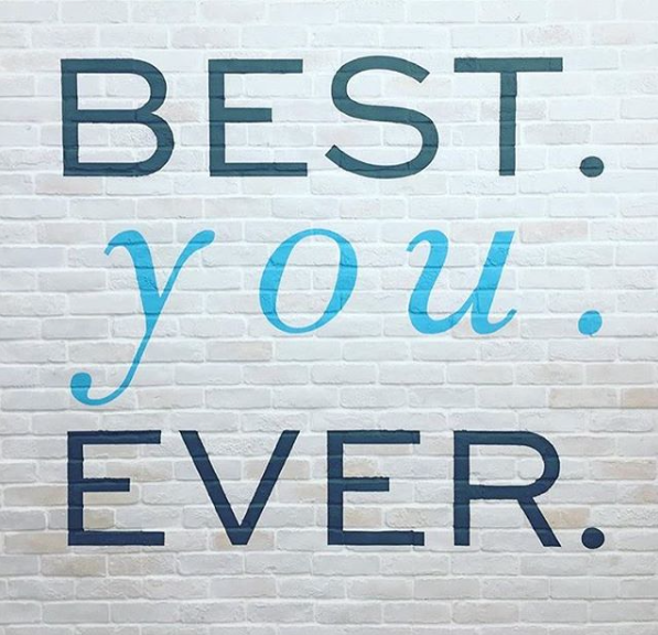
we also redesigned Physique 57 locations themselves to reflect the new brand aesthetic. from manifestos to murals; selfie mirrors to swag, the brand was fully integrated into all touch points of the customer experience.
Add your title here
This is the text area for this paragraph. To change it, simply click and start typing.
