Montclair
State University
case study
branding
collateral design
advertising
social media
video production
helping Montclair State spread its wings with a bold, dynamic, multi-channel campaign.
more than 22,000 students are enrolled at Montclair State University, where they’re offered more over 300 majors, minors, concentrations, and certificate programs. this nationally-ranked research institution is a story of unprecedented growth and momentum. a story that needed to be told. so, how do you brand a university, while meeting the disparate needs of its diverse schools and programs?
Red Hawk Ready
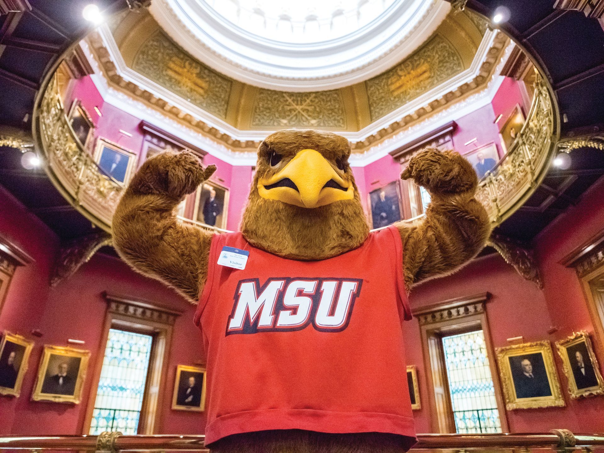
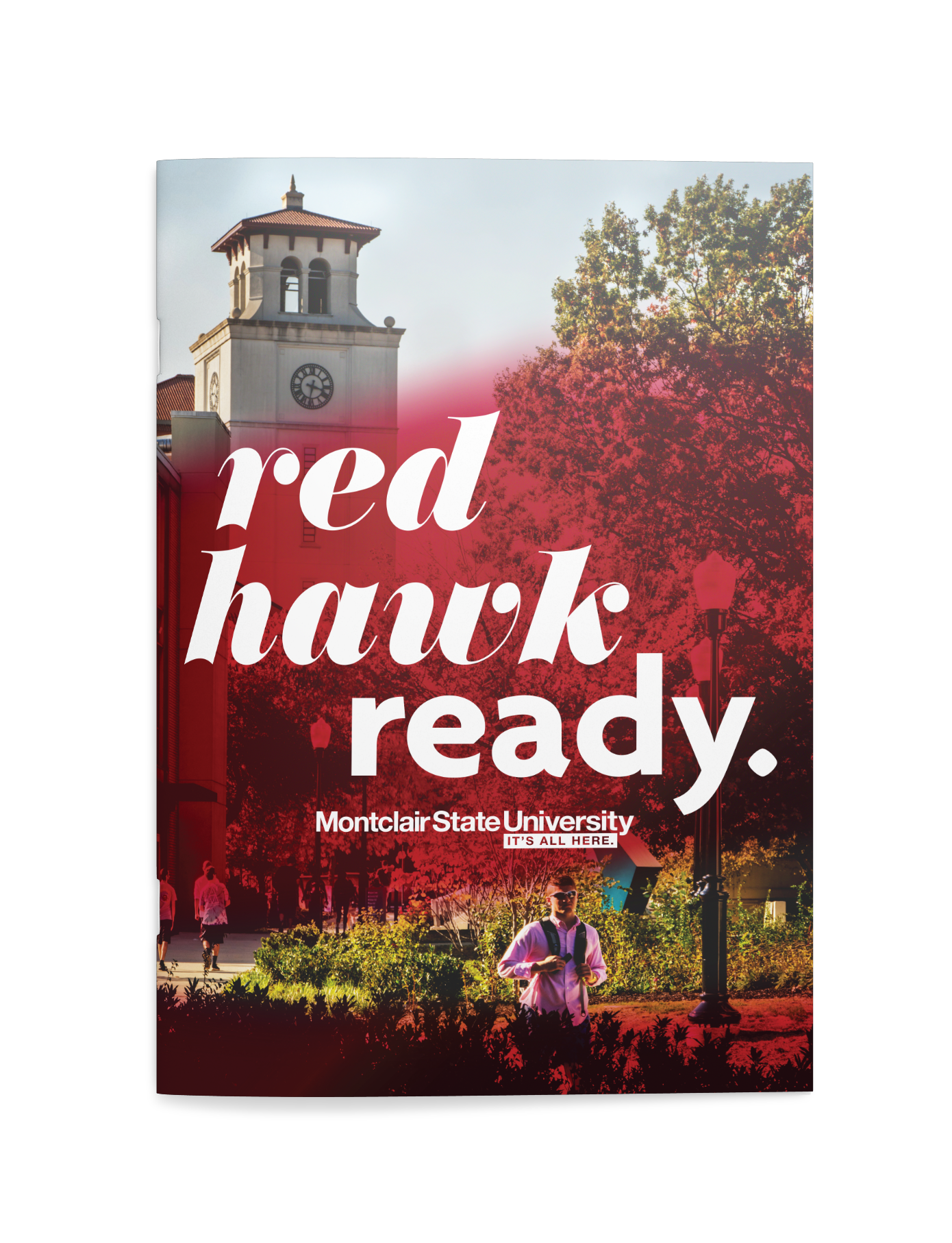
after interviewing all School and College Deans, we dug deep to build high—and discovered among many things that Montclair State’s mascot, the “red hawk” had yet to be leveraged in their branding. with the in mind, we developed an anthemic brand concept with the flexibility to speak both universally and specifically to this spectrum of benefits with a compelling design that framed quick brand takeaways. we called the campaign
Red Hawk Ready.
Add your title here
This is the text area for this paragraph. To change it, simply click and start typing.
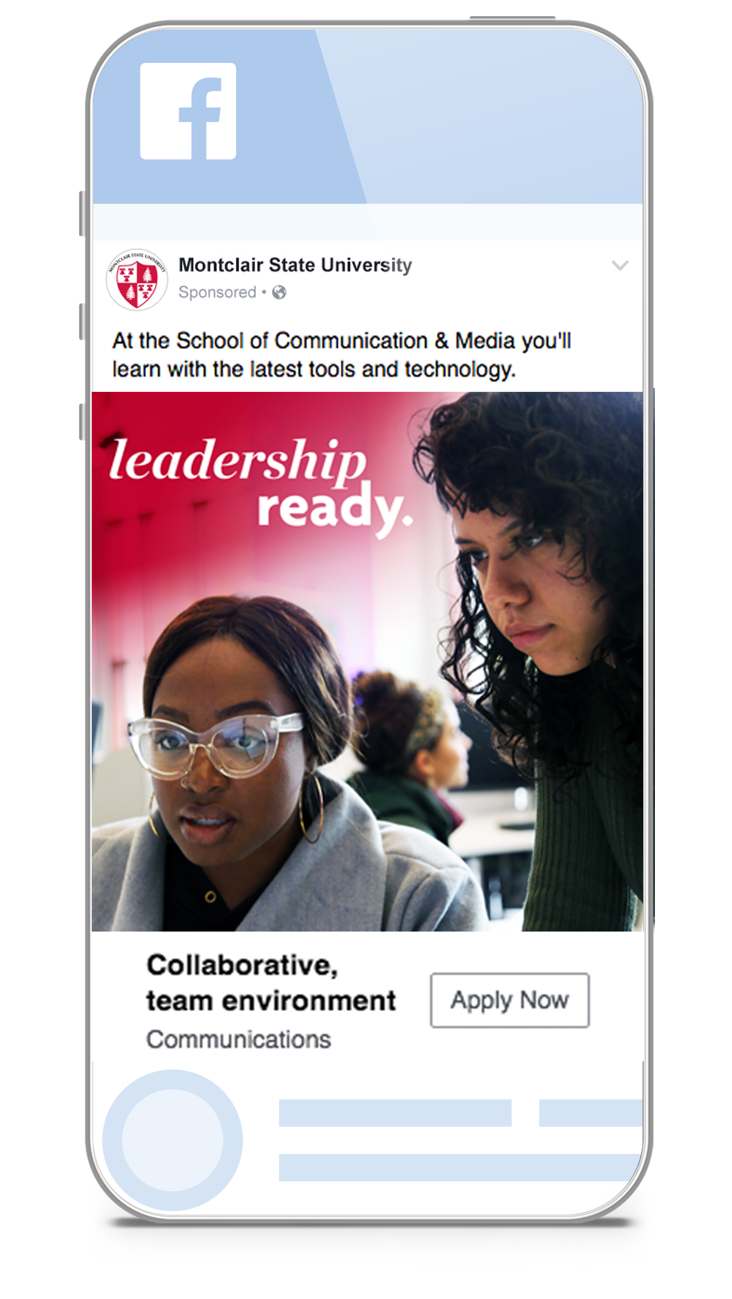
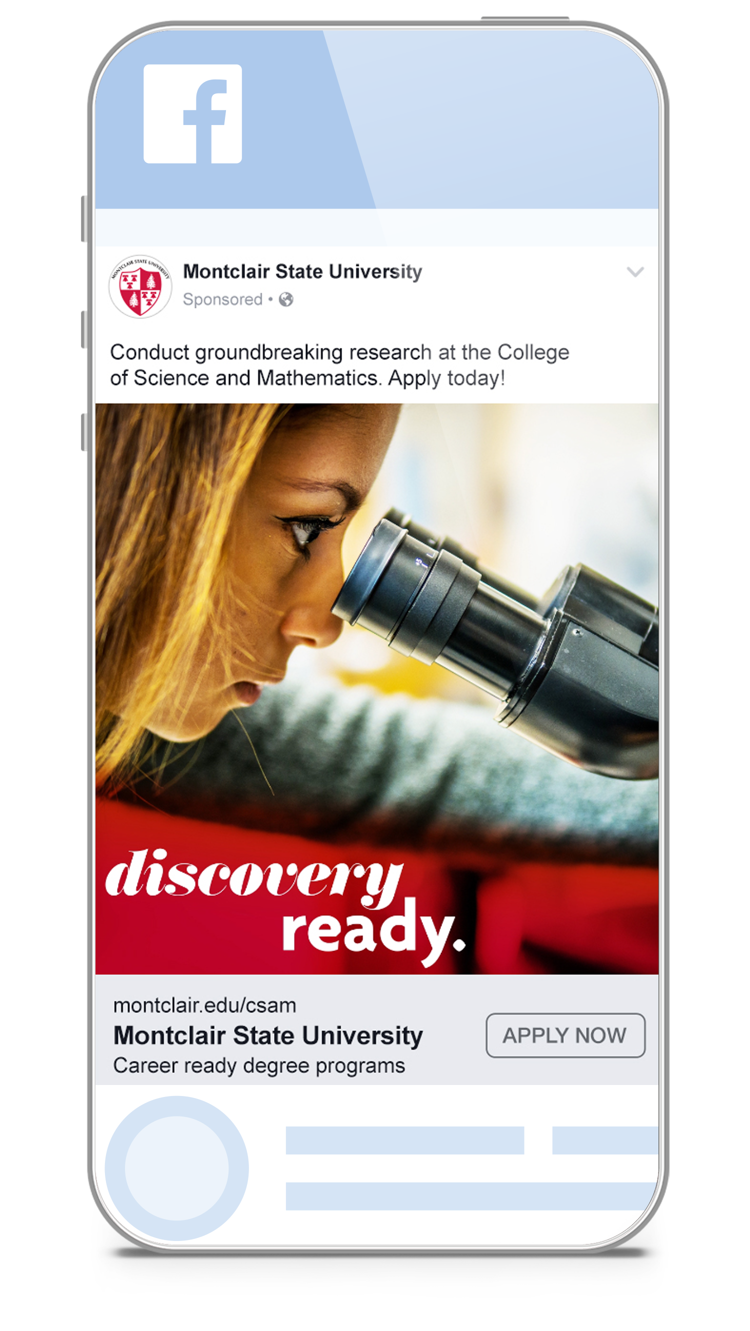
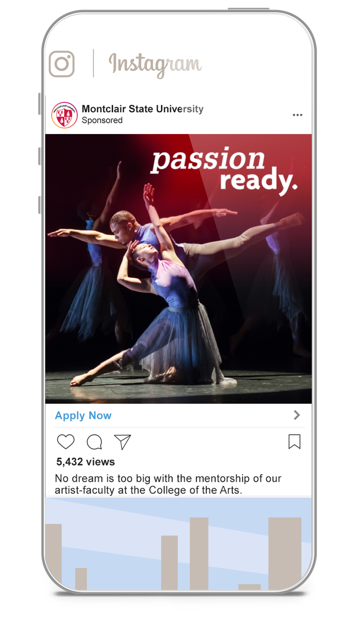
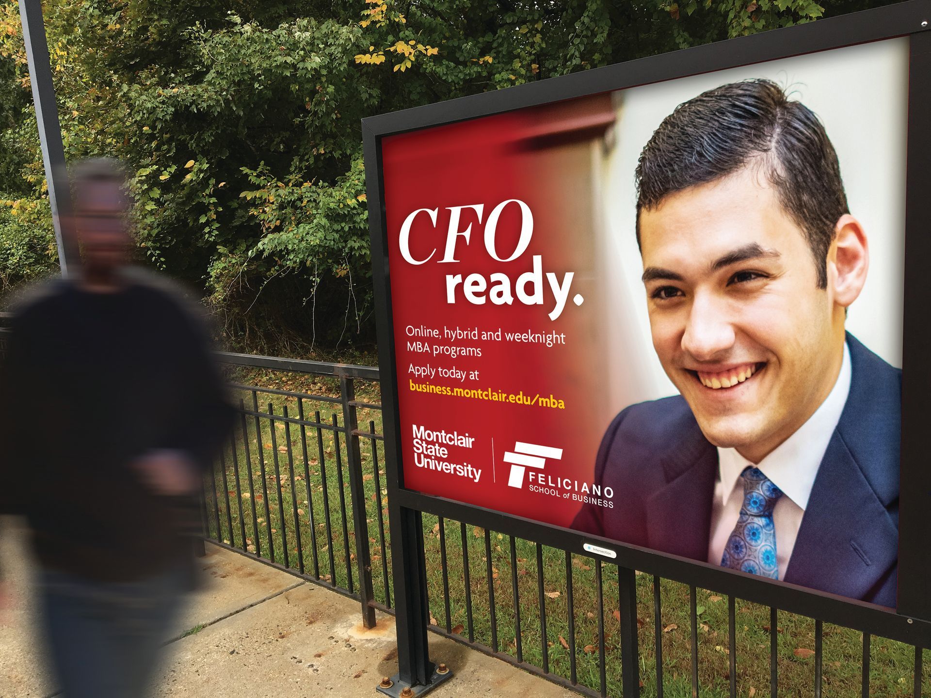
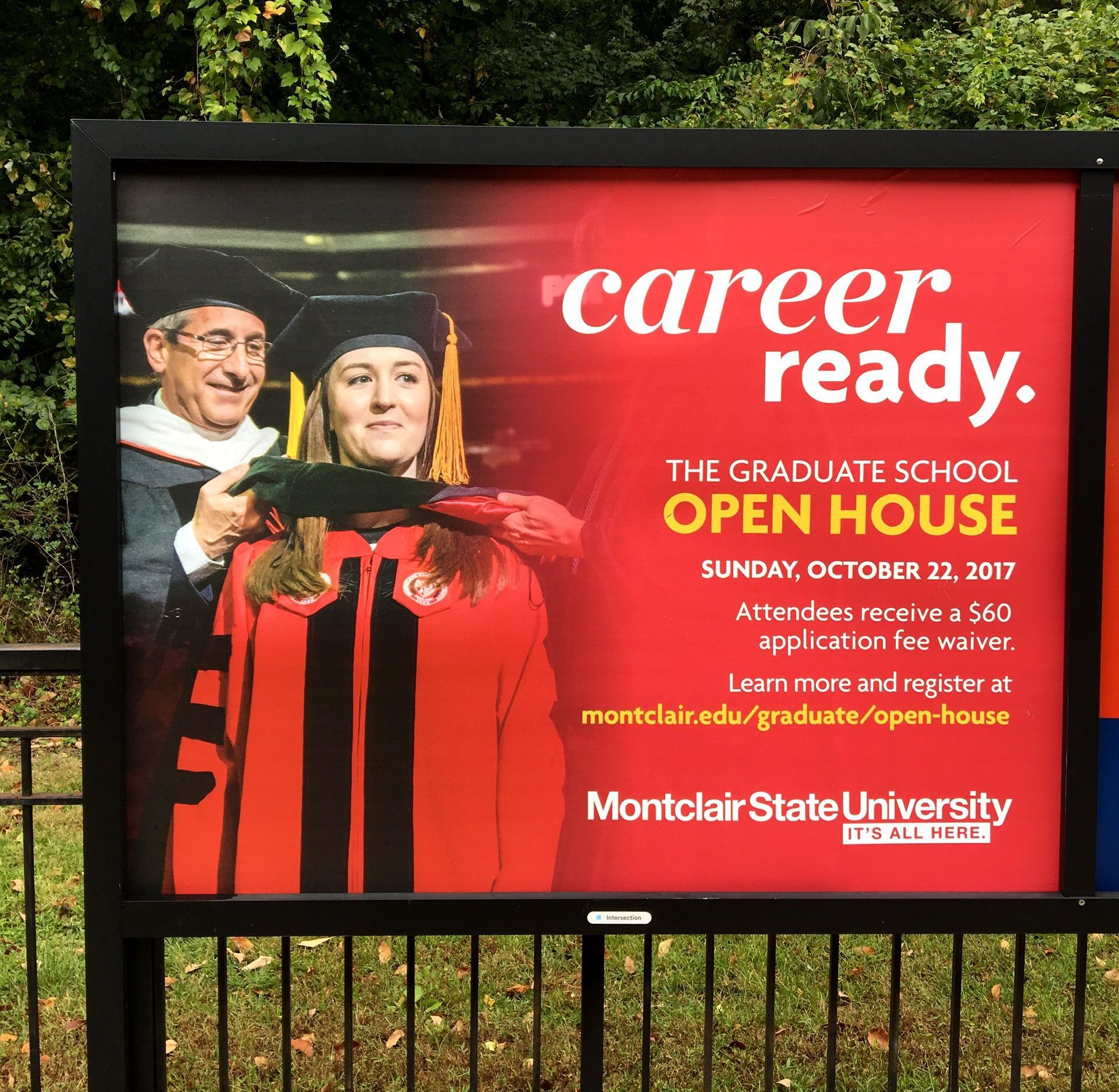
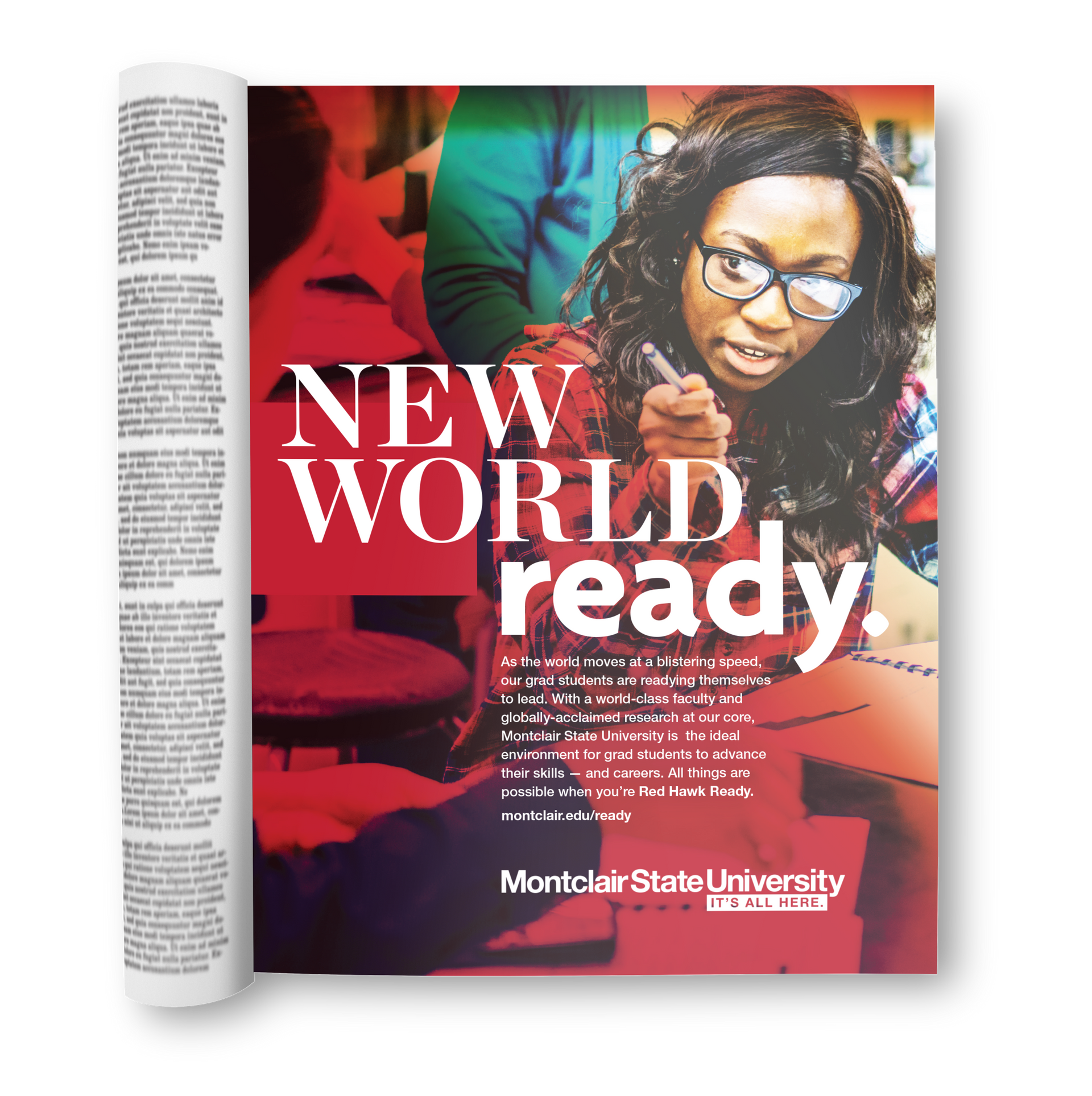
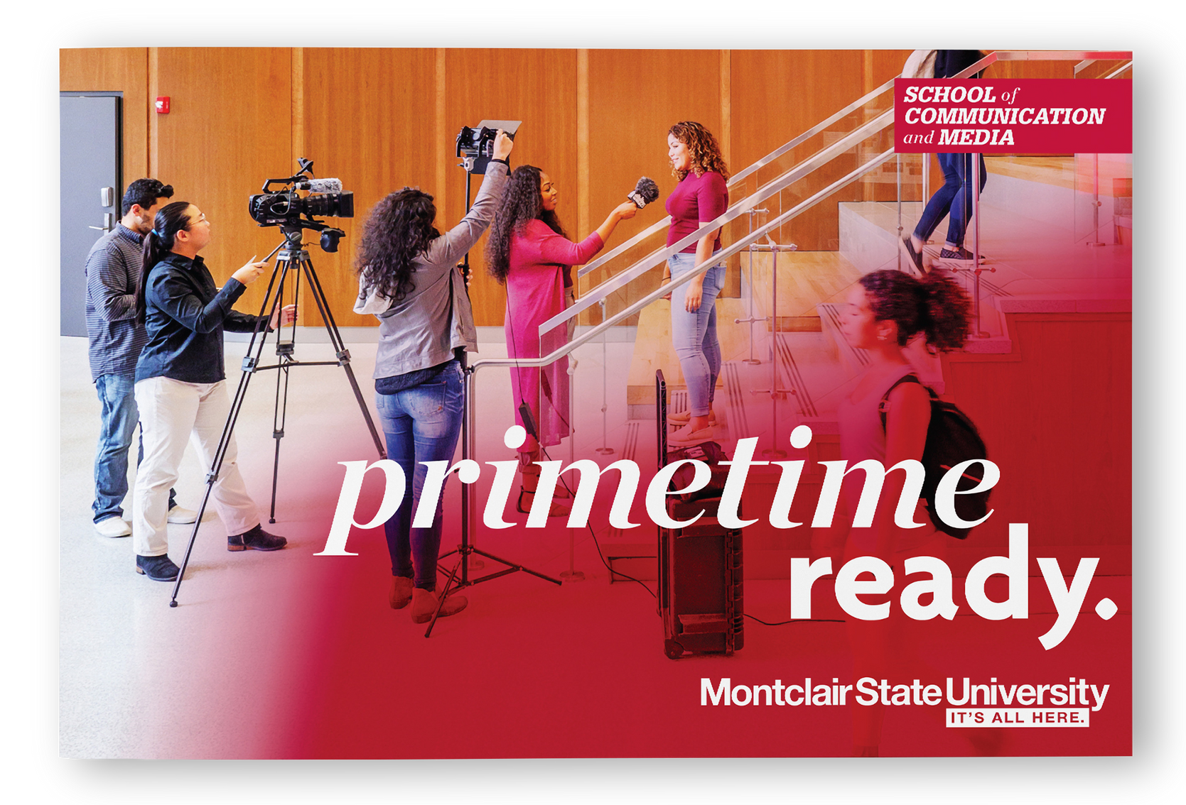
centering on the higher order benefit of preparing students for successful well-rounded lives, the campaign speaks to the many ways in which Montclair State readies its students to realize their diverse goals. and using the 'Ready' format provides the flexibility to address key selling points for each school and objective. for example:
MBA: C-Suite Ready
Fine Arts: Virtuoso Ready
Add your title here
This is the text area for this paragraph. To change it, simply click and start typing.
our media strategy included digital display, paid social (facebook, instagram, snapchat), print, ooh, and ott video.
enrollment materials were so well received, we were asked to create president reports, development materials, campus signage, bus wraps, and annual reports.
Add your title here
This is the text area for this paragraph. To change it, simply click and start typing.
our next-generation design centers on MSU’s core-color red—with typography that’s reflects the progressive nature of the school, and while other schools in the region are branded red, we made sure Montclair State was the only school to own it.
Add your title here
This is the text area for this paragraph. To change it, simply click and start typing.
after the campaign launch, undergraduate admissions trended up 119%, and submitted and completed applications were up 20%. attendance at their undergraduate Open House was a triple-record breaker in the recorded history of Montclair State campus recruitment events, with the largest number of student sign-ups, attendees and walk-ins. after year one, the total number of promoted campus tours were up 26.15%.
