view our featured work. or, view work by:
the watsons

we’re the watsons.
we specialize in advertising, advocating, anxiety-relieving, asking, branding, challenging, cost-saving, designing, digging, listening, pivoting, & supporting.
we’re fond of small type, big pours, and dogs of all sizes.

WATSNEW


filter: featured work.

the work.

ct department of transportation

the watsons are thrilled to announce the launch of a new statewide media campaign to encourage connecticut residents to ride the state’s rail and bus systems.
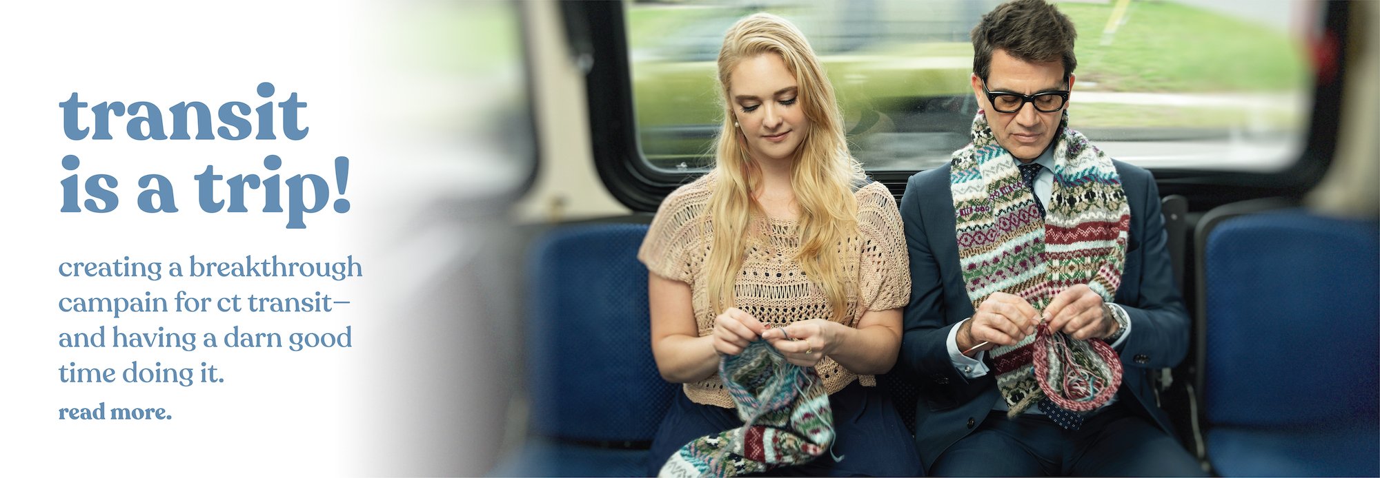


transit is a trip!

nationwide, transit, has yet to regain its pre-pandemic ridership. so, we watsons partnered with the amazing ctrides and cdot to do something about that—and broke a mold or two in the process.

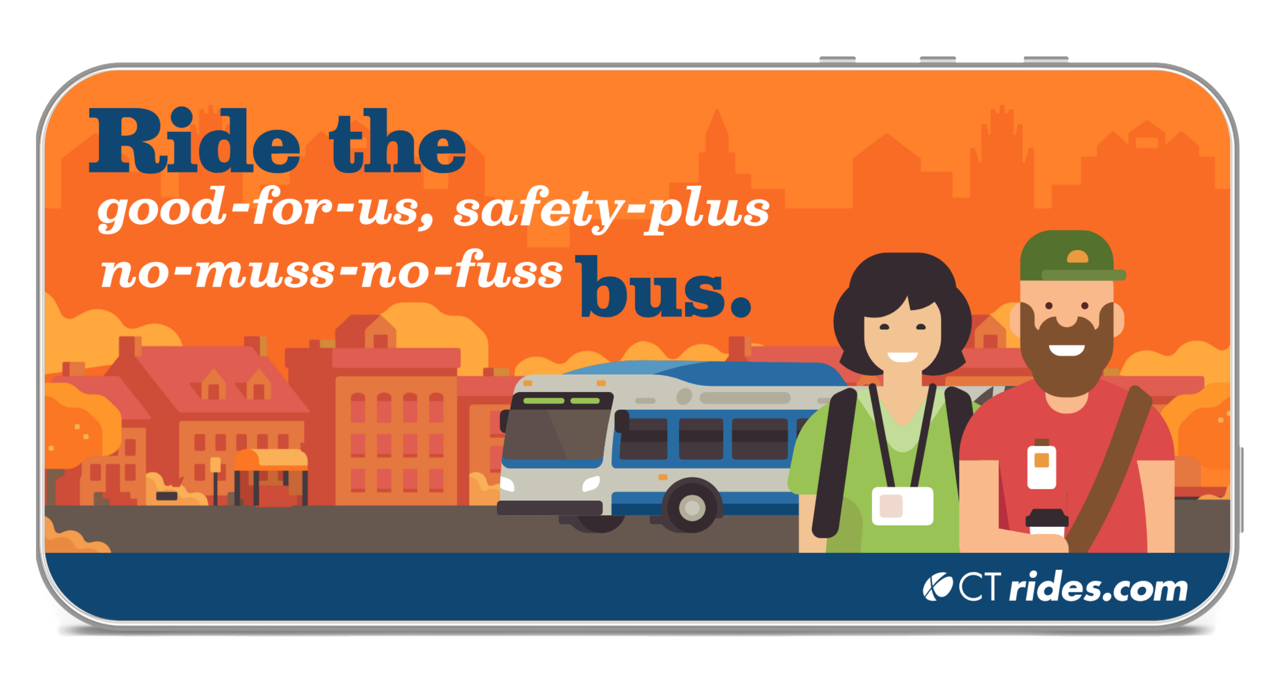
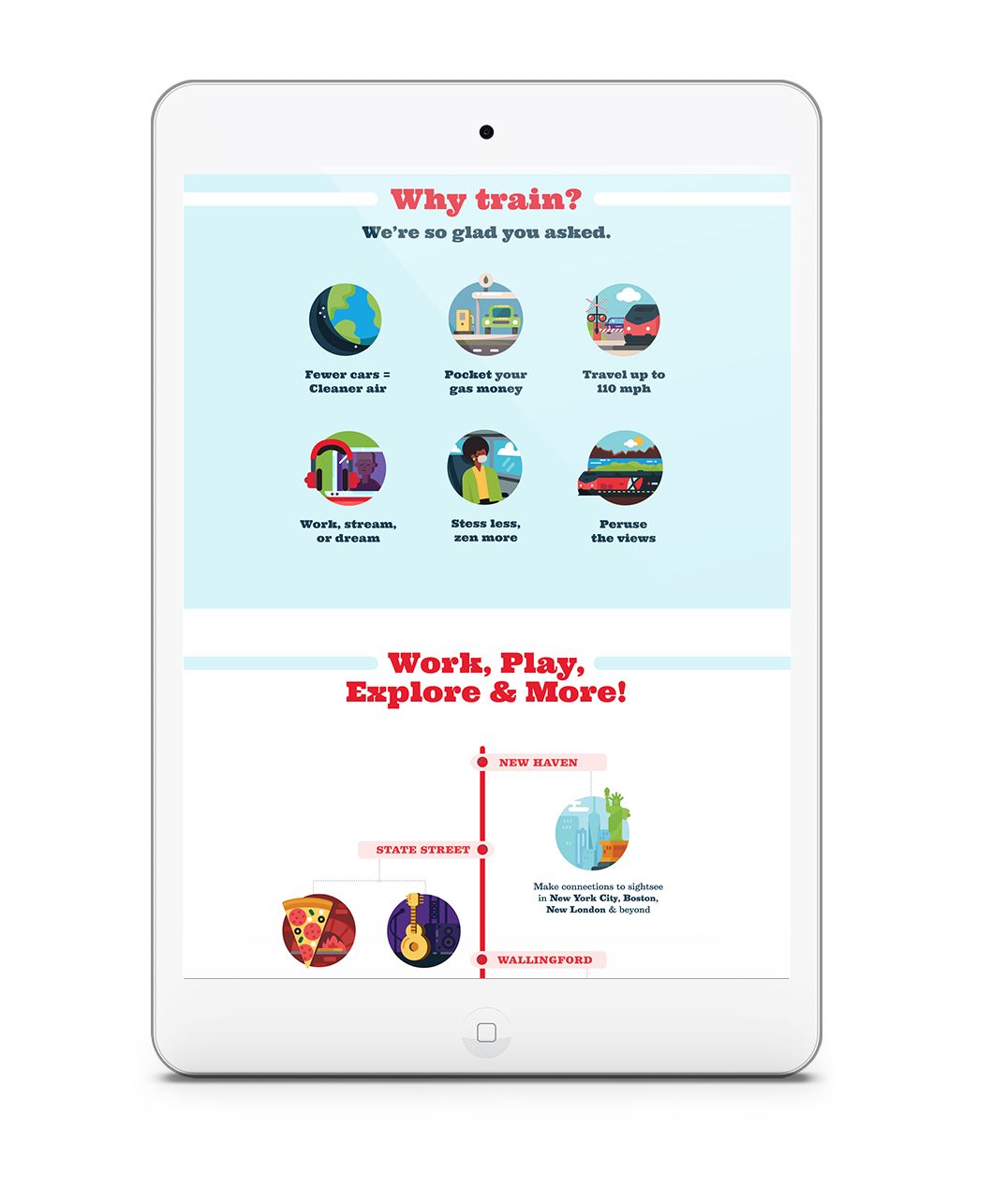
you see, transit is a wonderful thing. it’s not just good for the environment, it has countless benefits for the humans who call our planet home. but rather than create a traditional transportation demand management (tdm) campaign, we wanted to take our targets on a very special ride. one that was bold, out-of-the-box and that forged emotional connections and created new routines.


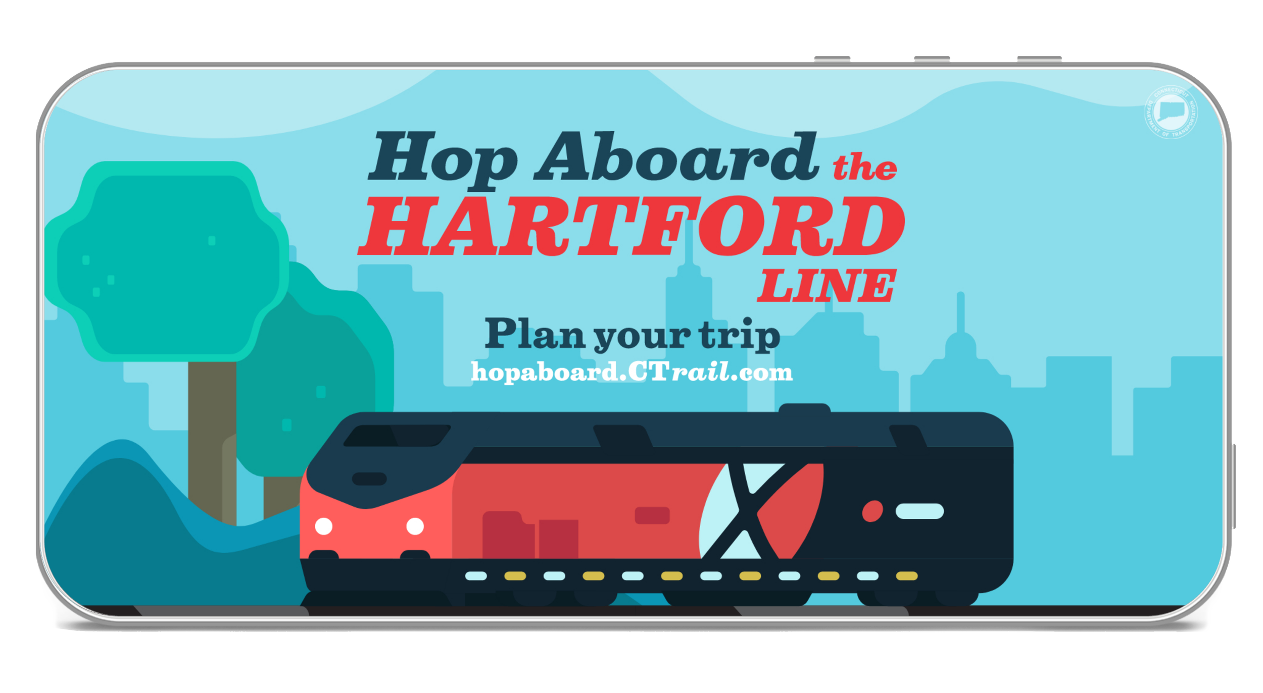
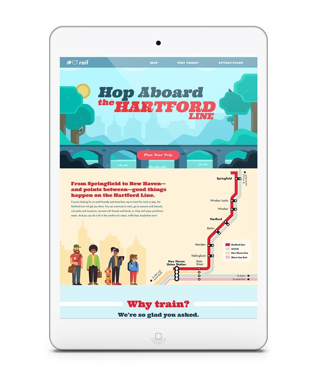
using paid social, out-of-home, digital display, sem, geo-targeting, and gas, bus, and train station advertising, we developed a concept that brings the benefits of transit to life in short, humorous scripted vignettes led by the brilliantly talented, and awfully funny, george hahn.

we see george on trains and buses engaging with other passengers, aka very talented actors, in a number of humorous scenarios—all of which allow our targets to see transit in an unforgettable way. and it’s encapsulated by our tagline: transit is a trip.


the campaign features brand colors and a modern, poppy, and celebratory illustration style to fly in the face of “uncool” transit expectations. and the inline font is a nod to transit lines.

extraordinary clients, brilliant cast and crew, it’s safe to say this campaign was a ride of a lifetime for all concerned.


amtrak valley flyer

we love trains. we just do. so when given the chance to create a branding campaign for the train line with the coolest name on the tracks, the valley flyer, we watsons were all aboard. 

the amtrak valley flyer

the amtrak valley flyer train service operates in western mass, and the marketing is run and managed out of franklin county by the franklin county regional council of governments (frcog). the valley flyer travels along the knowledge corridor in the heart of new england from the coast of connecticut in new haven through the culturally rich pioneer valley with stops in greenfield, holyoke, and northampton. it runs seven days a week with connections in new haven’s union station, allowing travel between central connecticut, western massachusetts, and new york city.

with competing modes of transportation and new england destinations, our objectives were two-fold. build a brand from the ground up that would provide the valley flyer the showcase it required to fulfill the goals of the pilot program, and with brand in hand, create top-of-mind brand awareness and put fannies in seats. we worked with stakeholders across municipalities to create everything from a variable logo, to the brand’s tone of voice, visual platform, and an integrated media strategy.


multi-channels for multi-targets.

while our primary targets are people traveling from western massachusetts to new haven and new york city, we’re also targeting new yorkers traveling outside of the city. in doing this, our western mass channel strategy included display & native digital, paid social, search, terrestrial radio, print, and out-of-home. our new york media included display & native digital, social media, search, and digital.

we also partnered with time out new york, executing both a special digital takeover and content creation that highlighted top attractions and activities along the train line.


our campaign: making stops 

we first developed a variable logo that reflected the changing colors of the area — orange for fall to reflect the beautiful autumn landscapes in the region; blue in the summer to evoke the river getaways, etc. from there, we developed a campaign that uses quickly digestible headlines that feature three points of interest each, while promoting the benefits of train travel over driving. each execution also includes the service areas of greenfield, holyoke, and northampton. points of interest on the valley flyer line are written using playful language and alliteration to create accessible, memorable messaging. visually, we used reportage style imagery that allows the target to see themselves and select-in to various aspirational experiences.

nyc public markets

as both foodies and new yorkers, we were beyond happy to shine a light on new york city public markets — thriving celebrations of the diverse communities and cuisine of the city we love.

NYCEDC_phone_kiosk_A_web.jpg

new york city public markets were born when mayor fiorello la guardia fought to keep food affordable for new yorkers and to provide indoor space for the city’s growing population of street vendors in the midst of the great depression. today, the key markets include essex market in the lower east side, la marqueta in harlem, arthur avenue in the bronx, moore street market in east williamsburg, 13th avenue retail market in borough park, and jamaica market in queens. and we watsons have created a new master brand, shining a bright new light on their vibrant past, present—and future!

per the nycedc vice president of retail markets, “the vibrant new branding and campaign for new york city public markets aim to increase visibility and raise awareness of these vital community and cultural hubs for affordable, healthy, and diverse food. we are proud to be launching these resources to provide crucial support to our small businesses who might otherwise find it difficult to open and operate in a prime retail location in the city or invest in marketing and promotional resources.”

NYCEDC_mailer_web.jpg
publicmarkets_logo.png

per the nycedc vice president of retail markets, “the vibrant new branding and campaign for new york city public markets aim to increase visibility and raise awareness of these vital community and cultural hubs for affordable, healthy, and diverse food. we are proud to be launching these resources to provide crucial support our small businesses who might otherwise find it difficult to open and operate in a prime retail location in the city or invest in marketing and promotional resources.”

NYCEDC_comp_home_laptop_web.jpg

the new website houses all of the markets in a bright, colorful design that extend the brand personality introduced with the new logo. the site promotes the nyc public markets master brand, while allowing the individual market brands to shine in their individual ways—complete with vendor lists and profiles.

the site takes users to market to experience the people, food, and events each has to offer. using immersive, full-width photos of people from all walks of life in the markets, carrying their bounty, our messaging speaks to heritage, tradition and city pride in an accessible tone that’s decidedly nyc.

last, but not least, our new, multi-lingual out-of-home, print and digital campaign—punctuated with a new tagline—shines a light on the wondrous finds contained within each market—and the promise of exciting things to come: good things are in store.

 
NYCEDC_phone_kiosk_B_web.jpg
NYCEDC_linknyc_A_web.jpg
ctrides

from print to digital—and website to out-of-home—we took ctrides in new directions with a re-brand—and every bit of it’s been a joyride.

ctrides billboard

ctrides is a brand, that simply said, exists to do good. their mission? to make connecticut a healthier place to live and work by reducing single occupancy vehicles (sovs), the state’s highest source of greenhouse gases.

they have two primary targets to help reach this goal: employers who encourage employees to use car pooling, van pooling, cycling and walking and commuters themselves. 

CTR_Billboard_2_web.jpg
CTR_Digital_Ad_320x480 copy.gif

driving change, not cars

when the watsons were named agency of record, ctrides was already at the forefront of commuter management programs, but there was broad opportunity to develop a strong brand story and voice and encourage greater use of the resources they provide. from brand vision and proof points, to tone of voice, design and illustration style, we created an integrated campaign that included collateral, digital, out-of-home, website, radio, and more. to increase ctrides’ brand awareness, we created a tagline that also served as a higher-order descriptor: fewer cars. better air. healthier lives.

CTR_comp_commuter_home_laptop_web.jpg

designs on a healthier connecticut.

our design needed to accomplish a number of goals. it had to be modern, appeal to a wide demographic, and convey an instant accessibility. functionally, it had to incorporate a diverse representation of people, connecticut-specific locations — and be equally effective promoting a variety of programs.

04-brochure-a4-hor_back-spread_web.jpg

to accommodate these goals, the watsons decided early on to hire illustrators with experience in the transportation space to create a colorful, contemporary inventory of images that could provide all of the assets we needed—in a compelling way. 

our color palette leveraged the brand’s existing logo colors—and incorporated new, modern colors that elevated the brand’s look. 

next stop: help ct residents get back on track after the pandemic.

when ctrail, part of ctdot, set a date to restore their hartford line’s pre-pandemic schedule, we watsons created a campaign to get the word out. but our messaging had a bit of work work to do. not only did we need to raise awareness among ct residents, we had to overcome concerns about safety. looking to create a warm, welcoming, optimistic educational campaign,“hop aboard the hartford” was born.

using pre-roll, social, a landing page, digital, and direct mail to reach residents at home, we brought a fresh illustration style to life with color, modernity, information, and animation, highlighting points of interest along the line. all aboard!

new york city condom

in new york? need a free condom? we’ve got you covered with our condom finder app. created for the new york city department of health, access to condoms has proven highly effective in preventing the sexual transmission of HIV and other sexually transmitted infections (STIs). the app, a roadmap featuring 3500+ free condom locations throughout the five boroughs, is just what the doctor ordered.  

 
digital_newyorkcity_condom_app_1_850.jpg
digital_newyorkcity_condom_app_2_850.jpg