view our featured work. or, view work by:
the watsons

we’re the watsons.
we specialize in advertising, advocating, anxiety-relieving, asking, branding, challenging, cost-saving, designing, digging, listening, pivoting, & supporting.
we’re fond of small type, big pours, and dogs of all sizes.

WATSNEW


filter: featured work.

the work.

ct sun

there are dream clients and then there are pinch-us clients. the wnba’s connecticut sun is most definitely among the latter for this women’s sports loving agency.


here comes the sun.

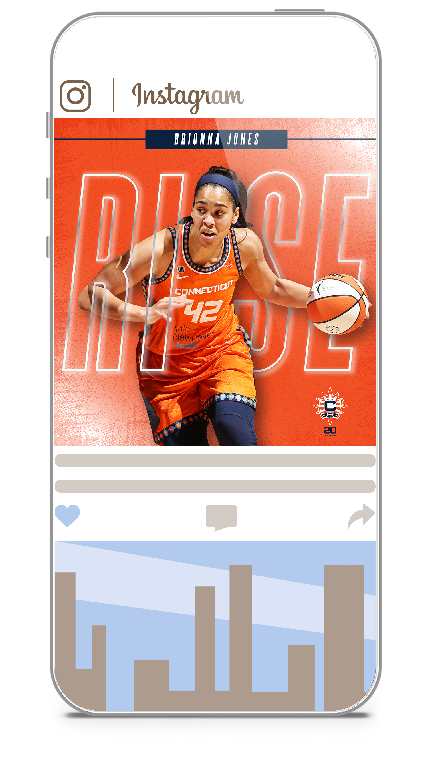
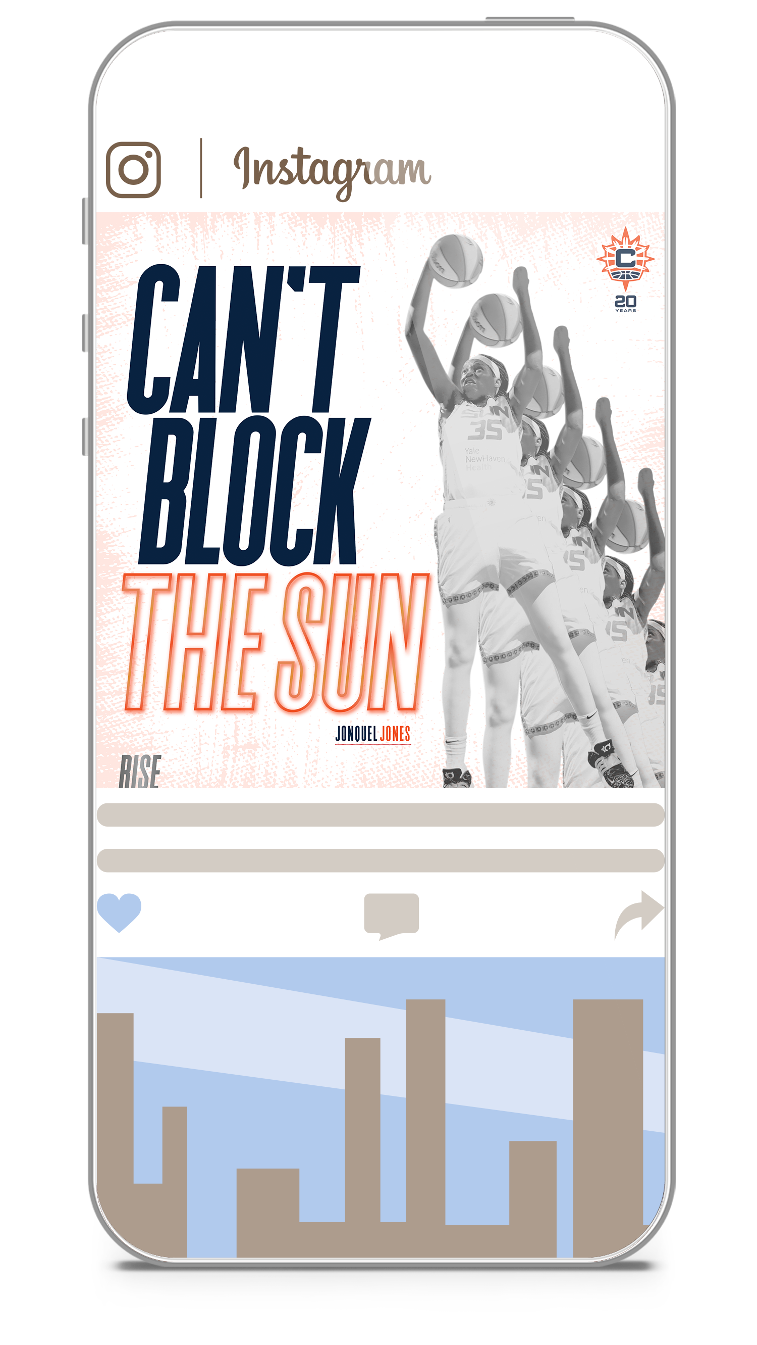
the opportunity to refresh the wnba’s connecticut sun brand for their 20th year anniversary has turned out to be everything we hoped it would—and much, much more. the team is comprised of wildly talented, socially-active, down-to-earth elite athletes. an inspiration on and off the court. and we created a look and feel that reflects their fire. after adapting their logo to celebrate their 20th year, we developed a modern, dynamic, in-your-face design that brings the brand’s fire to the digital landscape. new messaging turned up the team’s volume and kicked off with a new tagline that speaks to their integrity and trajectory: RISE.

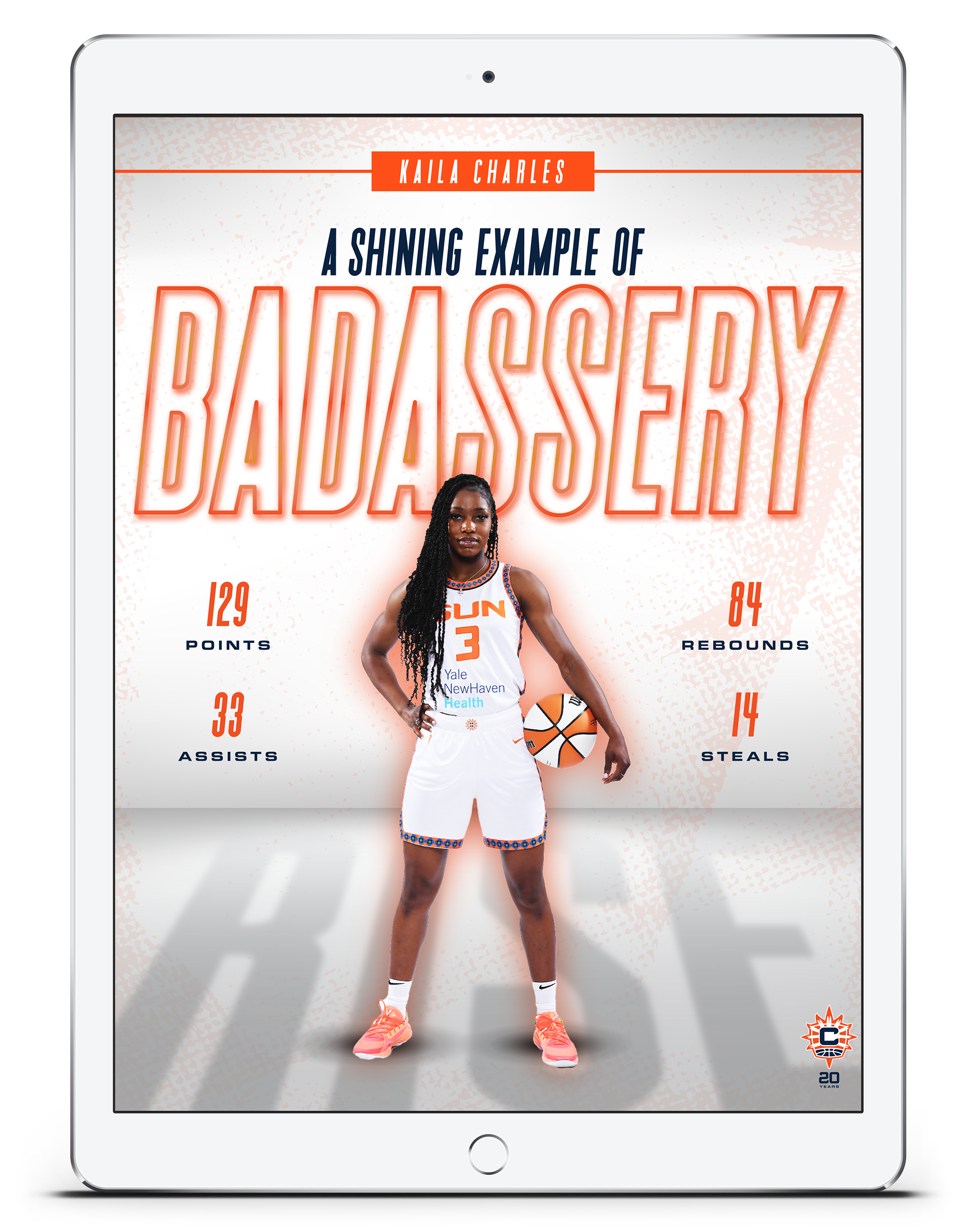
when all is said and done, the connecticut sun are a shining example of why we love what we do.

ct department of transportation

the watsons are thrilled to announce the launch of a new statewide media campaign to encourage connecticut residents to ride the state’s rail and bus systems.


transit is a trip!

nationwide, transit, has yet to regain its pre-pandemic ridership. so, we watsons partnered with the amazing ctrides and cdot to do something about that—and broke a mold or two in the process.

you see, transit is a wonderful thing. it’s not just good for the environment, it has countless benefits for the humans who call our planet home. but rather than create a traditional transportation demand management (tdm) campaign, we wanted to take our targets on a very special ride. one that was bold, out-of-the-box and that forged emotional connections and created new routines.


using paid social, out-of-home, digital display, sem, geo-targeting, and gas, bus, and train station advertising, we developed a concept that brings the benefits of transit to life in short, humorous scripted vignettes led by the brilliantly talented, and awfully funny, george hahn.

we see george on trains and buses engaging with other passengers, aka very talented actors, in a number of humorous scenarios—all of which allow our targets to see transit in an unforgettable way. and it’s encapsulated by our tagline: transit is a trip.


the campaign features brand colors and a modern, poppy, and celebratory illustration style to fly in the face of “uncool” transit expectations. and the inline font is a nod to transit lines.

extraordinary clients, brilliant cast and crew, it’s safe to say this campaign was a ride of a lifetime for all concerned.


amtrak valley flyer

we love trains. we just do. so when given the chance to create a branding campaign for the train line with the coolest name on the tracks, the valley flyer, we watsons were all aboard. 

the amtrak valley flyer

the amtrak valley flyer train service operates in western mass, and the marketing is run and managed out of franklin county by the franklin county regional council of governments (frcog). the valley flyer travels along the knowledge corridor in the heart of new england from the coast of connecticut in new haven through the culturally rich pioneer valley with stops in greenfield, holyoke, and northampton. it runs seven days a week with connections in new haven’s union station, allowing travel between central connecticut, western massachusetts, and new york city.

with competing modes of transportation and new england destinations, our objectives were two-fold. build a brand from the ground up that would provide the valley flyer the showcase it required to fulfill the goals of the pilot program, and with brand in hand, create top-of-mind brand awareness and put fannies in seats. we worked with stakeholders across municipalities to create everything from a variable logo, to the brand’s tone of voice, visual platform, and an integrated media strategy.


multi-channels for multi-targets.

while our primary targets are people traveling from western massachusetts to new haven and new york city, we’re also targeting new yorkers traveling outside of the city. in doing this, our western mass channel strategy included display & native digital, paid social, search, terrestrial radio, print, and out-of-home. our new york media included display & native digital, social media, search, and digital.

we also partnered with time out new york, executing both a special digital takeover and content creation that highlighted top attractions and activities along the train line.


our campaign: making stops 

we first developed a variable logo that reflected the changing colors of the area — orange for fall to reflect the beautiful autumn landscapes in the region; blue in the summer to evoke the river getaways, etc. from there, we developed a campaign that uses quickly digestible headlines that feature three points of interest each, while promoting the benefits of train travel over driving. each execution also includes the service areas of greenfield, holyoke, and northampton. points of interest on the valley flyer line are written using playful language and alliteration to create accessible, memorable messaging. visually, we used reportage style imagery that allows the target to see themselves and select-in to various aspirational experiences.

johns hopkins medicine

johns hopkins medicine is a place in which extraordinary people do extraordinary things every day. we watsons are honored to have created a new employment branding campaign that brings that very notion to light – and at a time when finding talent takes new thinking.


after onboarding eleven of johns hopkins’ entities, we developed branding campaigns for both nursing and key staff. in doing so, we created a resonant master brand flexible enough to allow for disparate selling points of each entity. 


creating a campaign starts with a tagline.

for positioning, we created a manifesto for both nursing and key staff, specifically transporting, linen services, environmental services, and food & nutrition. not only do the manifestos establish our positioning, they also convey key messaging and tone of voice – and culminates in a new theme line: be a part of something bigger.


the theme line enforces a higher order benefit that supports the familial culture, speaks to the size and structure of the organization leading to greater opportunity, and references working with purpose. this “caregivers one and all” approach for nurses and key staff became a multi-channel strategy that includes digital, social, linkedin, pandora, and a unified landing page.

working theater

when we were asked to create a new brand for a wildly creative theater company that honors new york’s workers – and believes that theater should be affordable and accessible to all – first, we screamed a little, then we got to work.


a new brand that works for everyone.

the watsons were tasked with creating a full rebrand to include comprehensive guidelines — and digital, social, event, and collateral assets. we also developed canva templates for social and email that allowed working theater to produce them in-house and in brand compliance.

the new brand aesthetic was inspired by the posters, flyers, buttons, and signs of the various movements throughout history for workers’ rights, racial justice, political revolutions, and social causes. generally produced in a diy fashion, the materials were often put together hastily by grassroots community organizers, union workers, and ordinary citizens. 

the power of these resonant vehicles is derived from their audaciousness, urgency, authenticity, emotionality, and bold call-to-arms.

while the graphic design of this genre has historically ranged in style, we referenced some commonalities to spotlight working theater’s mission to tell stories that reflect the diverse communities that comprise the working majority. stories that acknowledge oft-denied power and advocate for equality, fairness, and justice.

in marrying this look with the working theater mission, we position the theater as a brand built around the lives and legacies of organizers, advocates, defenders, educators, champions, and, ultimately, catalysts of transformation.


virtua health system

when you’re a brand that exists to save lives and bring new ones into the world, you’re more brand virtue than brand benefit. how suitable then, to be asked to create a branding campaign for virtua health system’s breast cancer, obstetrics, and midwifery arms.


uncovering the virtues of virtua health system.

the watsons partnered with virtua health system in creating new, multi-channel ad campaigns to promote their exceptional offerings in breast cancer, obstetrics, and midwifery care. while they’re the largest health care provider in southern new jersey, the depth and scope of their expertise and program weren’t always top-of-mind.

treating the isolation in breast cancer.

to best convey virtua’s unique approach to treating patients with breast cancer, we pushed the level of individual support they provide to the forefront of our messaging. the fact is, every patient is provided their own nurse navigator who educates, supports, and advocates for them through every step of their journey. the messaging is less about touting virtual’s services than sharing their commitment to being there physically and emotionally for every patient.

two campaigns were developed, one with mantra-like messaging in type-only, and the other with evocative imagery—both shining a light on virtue’s unique commitment to helping people thrive—via personal, compassionate—and expert care.

something to love for every mom-to-be.

virtua was one of the first to recognize that the ways in which women wish to manage their pregnancies are as unique as the women themselves. as a result, they now provide the most comprehensive obstetrics and midwifery services in the region. pregnant women are encouraged to create their own maternity blueprints that perfectly their needs and wishes – and those of their families.

while laying out these services, the campaign also educates about the art and science of the lesser-known practice of midwifery. using aspirational, true-to-life imagery with resonant messaging, we showcased the spectrum of ways in which expecting women will receive more than they may have expected.

both campaigns used an integrated, targeted mix – digital, social, video, streaming radio, out of home, print, vehicle advertising, and more – all driving to a branded campaign landing page.

the organic project (top)

tampons. liners. and pads. oh my! and get this, they’re organic, biodegradable, and healthy for girls, their moms, and mother earth. our job? brand them and let the goodness flow!

branding a top notch mission-driven brand.

founded in 2018, the organic project (top) was created by two wily business exec-moms who came up empty-handed after searching for healthy, organic period products for their daughters. we watsons were asked to develop a shiny new rebrand that brings their story to light.

out of the gate, we developed brand vision and mission statements, laying the groundwork for messaging in both content and tone. rather than a standard positioning statement, we wrote a consumer-facing “womanifesto” that builds an evocative, humorous bridge between the brand and those it benefits. as we executed assets for each touchpoint — from packaging to point of sale, social to swag — our work culminated with a comprehensive brand guidelines book.

joy in a newly-designed box.

we then designed new packaging for all product SKUs, including tampons, pads, liners, sample packs, first period gift boxes, and new mom gift boxes. the updated brand aesthetic consists of soft, unexpected colors combined with a retro-mod, friendly serif that brings to mind women’s magazines of the 1970s.

a loud and proud digital campaign

using animated banners, short-form social animations, and sem, we put together a forward-thinking, insight-driven campaign that empowers girls through honest, often humorous messaging. we also built canva templates to give the client easy access to customizable, brand-compliant assets for social.

our design incorporates ultra-modern, 70s-inspired typography that brings bold confidence with a pinch of whimsy to every message. a clean palette of light blues with a textural background give a nod to the organic cotton and plant-based applicators that define the brand – and the messaging mirrors its environment with bold, playful, and unexpected brand promises.

nyc public markets

as both foodies and new yorkers, we were beyond happy to shine a light on new york city public markets — thriving celebrations of the diverse communities and cuisine of the city we love.

NYCEDC_phone_kiosk_A_web.jpg

new york city public markets were born when mayor fiorello la guardia fought to keep food affordable for new yorkers and to provide indoor space for the city’s growing population of street vendors in the midst of the great depression. today, the key markets include essex market in the lower east side, la marqueta in harlem, arthur avenue in the bronx, moore street market in east williamsburg, 13th avenue retail market in borough park, and jamaica market in queens. and we watsons have created a new master brand, shining a bright new light on their vibrant past, present—and future!

per the nycedc vice president of retail markets, “the vibrant new branding and campaign for new york city public markets aim to increase visibility and raise awareness of these vital community and cultural hubs for affordable, healthy, and diverse food. we are proud to be launching these resources to provide crucial support to our small businesses who might otherwise find it difficult to open and operate in a prime retail location in the city or invest in marketing and promotional resources.”

NYCEDC_mailer_web.jpg
publicmarkets_logo.png

per the nycedc vice president of retail markets, “the vibrant new branding and campaign for new york city public markets aim to increase visibility and raise awareness of these vital community and cultural hubs for affordable, healthy, and diverse food. we are proud to be launching these resources to provide crucial support our small businesses who might otherwise find it difficult to open and operate in a prime retail location in the city or invest in marketing and promotional resources.”

NYCEDC_comp_home_laptop_web.jpg

the new website houses all of the markets in a bright, colorful design that extend the brand personality introduced with the new logo. the site promotes the nyc public markets master brand, while allowing the individual market brands to shine in their individual ways—complete with vendor lists and profiles.

the site takes users to market to experience the people, food, and events each has to offer. using immersive, full-width photos of people from all walks of life in the markets, carrying their bounty, our messaging speaks to heritage, tradition and city pride in an accessible tone that’s decidedly nyc.

last, but not least, our new, multi-lingual out-of-home, print and digital campaign—punctuated with a new tagline—shines a light on the wondrous finds contained within each market—and the promise of exciting things to come: good things are in store.

 
NYCEDC_phone_kiosk_B_web.jpg
NYCEDC_linknyc_A_web.jpg
ctrides

from print to digital—and website to out-of-home—we took ctrides in new directions with a re-brand—and every bit of it’s been a joyride.

ctrides billboard

ctrides is a brand, that simply said, exists to do good. their mission? to make connecticut a healthier place to live and work by reducing single occupancy vehicles (sovs), the state’s highest source of greenhouse gases.

they have two primary targets to help reach this goal: employers who encourage employees to use car pooling, van pooling, cycling and walking and commuters themselves. 

CTR_Billboard_2_web.jpg
CTR_Digital_Ad_320x480 copy.gif

driving change, not cars

when the watsons were named agency of record, ctrides was already at the forefront of commuter management programs, but there was broad opportunity to develop a strong brand story and voice and encourage greater use of the resources they provide. from brand vision and proof points, to tone of voice, design and illustration style, we created an integrated campaign that included collateral, digital, out-of-home, website, radio, and more. to increase ctrides’ brand awareness, we created a tagline that also served as a higher-order descriptor: fewer cars. better air. healthier lives.

CTR_comp_commuter_home_laptop_web.jpg

designs on a healthier connecticut.

our design needed to accomplish a number of goals. it had to be modern, appeal to a wide demographic, and convey an instant accessibility. functionally, it had to incorporate a diverse representation of people, connecticut-specific locations — and be equally effective promoting a variety of programs.

04-brochure-a4-hor_back-spread_web.jpg

to accommodate these goals, the watsons decided early on to hire illustrators with experience in the transportation space to create a colorful, contemporary inventory of images that could provide all of the assets we needed—in a compelling way. 

our color palette leveraged the brand’s existing logo colors—and incorporated new, modern colors that elevated the brand’s look. 

next stop: help ct residents get back on track after the pandemic.

when ctrail, part of ctdot, set a date to restore their hartford line’s pre-pandemic schedule, we watsons created a campaign to get the word out. but our messaging had a bit of work work to do. not only did we need to raise awareness among ct residents, we had to overcome concerns about safety. looking to create a warm, welcoming, optimistic educational campaign,“hop aboard the hartford” was born.

using pre-roll, social, a landing page, digital, and direct mail to reach residents at home, we brought a fresh illustration style to life with color, modernity, information, and animation, highlighting points of interest along the line. all aboard!

rick’s picks snacking pickles

people love pickles. people love healthy snacks. and people are positively passionate about rick’s picks new snacking pickles, for which we developed the package design—and the entire brand. at the heart of it all is a happy little pickle-snacker named, kirby. illustrated in-house, kirby is a fun, mod brand character who’s loved by demos boomer to z. and kirby looks swell on swag, like t-shirts, stickers, beer koozies, and baseball hats. our branding work also includes a tagline—‘crispy, savory, cravey’—as well as collateral, landing page, and social assets.

ricks_picks_snacking_pickles_package_design1.jpg
ricks_picks_snacking_pickles_package_design2.jpg
ricks_picks_snacking_pickles_swag.jpg
ricks_picks_snacking_pickles_package_design3.jpg
kirby_watthumb3.gif
whole foods market

they were our oz. doers of good, worth the journey, and very, very green. they made us more passionate, intelligent, and courageous about our food. and they believed in the watsons. and so it was that we began a partnership with not one, not two, but three regions of whole foods market — and did a whole bunch of work that put us on the map.

adv_wholefoodsmarket_subway_1sheet.jpg
adv_wholefoodsmarket_timessquare_inmedia.jpg
adv_wholefoodsmarket_pedicab.jpg

when gotham became the emerald city.

using urban streets as our landscape, including billboards, in-store signage, train posters, and pedicabs, we set out to reach people where they live — and shop. 

we painted the town whole foods green with disruptive, whimsical messaging as pure and honest as the brand’s offerings.  with short, quippy lines that were quick and easy to read, we drove our messaging home to even the busiest passersby. we made them smile. we made them think, and, most of all, we reminded them what value really means. the stunning green designs jumped off of every medium, creating a look that was both conspicuous and beautiful. and the tagline summed up every message with a call to action: shop like you deserve it.™

the watsons took over times square, covering sidewalks with bio-friendly stenciling for new yorkers who had a pre-smartphone penchant for looking down. and we branded pedicabs, giving shoppers who spent over $50 on groceries, free rides home. we also ran the campaign on food blogs and nyc-centric sites.

the results? whole foods’ tribeca store experienced the brand’s biggest opening, messaging was adopted by the mid-atlantic region, they received press coverage for the campaign and pedi-cabs, and there was an increase in basket size among all existing stores in the region.

featured_wholefoodsmarket_subway_entrance.jpg
featured_wholefoodsmarket_bag.jpg

we had the next campaign on the bag.

next, we reached into our bag of tricks for something special. and as it turned out, the bag was all we needed. there’s no better proof of promise than a person with a bag full of groceries, so we shot consumers with bags featuring messages about value and quality. the campaign was seen on out of home that reached audiences where they lived, worked and walked in new jersey and manhattan. and, with life imitating art, the campaign was such a hit whole foods decided to feature the campaign's headlines on the bags they provide to their customers upon checkout – thus creating thousands of walking billboards all around town.

the campaign was such a success that it made its way to the windy city. having recently opened their third largest store in the world, we adapted the ooh campaign, shooting at iconic locations like the fullerton street el stop and the biograph theater. the new campaign converted chi-town shoppers into living, breathing testimonials.

adv_wholefoodsmarket_subway_2sheet.jpg

helping new yorkers stay prepared.

to raise the profile of their holiday prepared food offerings, the watsons created a campaign for the northeast that included out of home, digital and print in time out new york.

featured_wholefoodsmarket_cheese_app-850.jpg

APPetizing cheese.

does asiago go with honey or jam? is it best to get a semi-soft, mild, or a sharp spreadable? and did you know that to make a proper cheese board you need to have 4 different types of cheese? we teamed up with whole foods market’s mid-atlantic team to design an app that let’s you know exactly what kind of cheese you need based on pairings, texture, and type. 

users could customize their own cheese boards or shake the app for a handcrafted board from the brand’s amazing cheesemongers. it even featured cheese profiles for 72 cheeses. pairings could be shared on social, and users entered to win yummy, cheesy prizes. now, that’s something to smile about. 

doing their share over the holidays.

we created a tv campaign for whole foods’ midwest that brought back the kinder, gentler spirit of the holidays. the three heartwarming tales proved that sharing really is caring. handling concept, writing, producing, and editing — we and our incredible cast and crew (and very cool client) helped whole foods market spread some powerful holiday cheer.

stillwater

there was plenty of joy in watson-ville the day we shook hands with stillwater brands. these good people went and developed a line of cannabis-infused products then chose us to create the master branding from the ground up — and the package design for three skus. we’re still on a high!

featured_stillwater_lineup.jpg

this brand is our cup of tea.

stillwater launched with what has become their signature line of products: low-dose cannabis-infused teas for adults seeking refuge from daily stress.  because the tea is for grown ups, it was important our design separated itself from the myriad of loudly-packaged products targeting the stoner demo. so, we created a ’heritage‘ look that conveyed a sense of longevity, trustworthiness, maturity, and the notion that this product has a “higher order” benefit than getting the consumer stoned. packaged like artisanal teas, colors were desaturated to reflect the products’ calming effect, with each sku having its own color relevant to the names we created — and the flavors within.

featured_stillwater_AsSeenOn_logo_closeup.jpg

new logo, new tagline.

we designed the logo to be neither illicit, nor corporate. rather, we gave it a warmth, conveying a  sense of the human touch. the upward-bending baseline references the curvature of the earth expansive, open. and lastly, we created a drop of water in the middle of the w to represent the tea. to encapsulate the brand’s ability to manage daily stress, without the effects of smoking, alcohol, or pharmaceuticals, we created the tagline:  relax into life. 

featured_stillwater_ripple.jpg

the ripple effect.

stillwater’s latest product, ripple, is a zero-calorie, dissolvable beverage and baking enhancer. starting with the product and name only, we designed the logo and packaging to again tie to the stillwater master brand, while keeping its own identity distinctive. given the playful name and liberated nature of its portability, we used a brighter color palette and more spirited font treatment. to date, this has been one of the most successful products in the sector. 

featured_stillwater_clockwork_coffee.jpg

a modern design that turned back the clock.

stillwater brands’ next product was called ‘clockwork coffee’, a first-to-market cannabis-infused  instant coffee. with a visual reference to the brand’s other products, clockwork coffee embraced a mid-century design to reflect the inherent comfort and fun of america’s favorite beverage. 

while the packaging's retro-charm appeals to both the younger and older demo via a bright and sassy retro-charm, the tagline speaks to the coffee’s primary benefit: a calmer way to caffeinate: more wakey, less shakey.

grand central terminal

when we were named agency of record for grand central terminal in 2012, it was the beginning of a beautiful partnership. what could be better than using our watson wattage to shine a light on the 60 shops and 35 dining options that make the terminal a favorite destination? for us, in the grand scheme of things, it was the grandest.

branding_grandcentral_logointerior.jpg

a new logo for a century-old icon.

when the fine folks at grand central asked us to design a new logo, we endeavored to create an elegant blend of classic and modern—much like the terminal itself. an exploration of the original architecture led us to a mark that had been part of the building since its opening in 1913. 

the circular marble relief was a monogram with the letters “g”, “c”, and “t”. so, we partnered with type artist bryan patrick todd to artfully transform it into the elegant, new monogram—one that organically translates to a digital version.

the biggest influences for the new monogram came directly from the circular forms found around the building: the exposed lightbulbs of the beaux-arts chandeliers, and faces on both the info booth and famed tiffany clocks. and in an ‘easter egg’ nod to grand central’s railroad history—enthusiasts will notice that the spike in the letter “g” echoes the shape of a train spike used along the tracks.

the new grand central logo font, sackers gothic was inspired by engravers fonts popularized in the early 20th century. the font’s simple, all-capital forms reference that period, while the sans serif typeface imbues the logo with modernity.

it’s a classic case of everything old being new again. and a dream project we never dreamed possible!

featured_grandcentral_outofhome_advertising.jpg

advertising 60 shops and 35 dining options under one magnificent roof.

it was a big job, and the watsons were thrilled to do it. we, along with some of the city’s finest retail and architectural photographers, shot all the edible and shop-able reasons why locals and tourists come to grand central terminal. and let us tell you, there are many of them, each as amazing as they are photogenic. 

from shake shack to grand central market and vineyard vines to tumi, each picture paints a thousand wows. the snaps were used in collateral and in ads on city kiosks, station and interior posters, metro wraps, time out new york, and in digital.

adv_grandcentral_printad.jpg
digital_grandcentralterminal_Shop&Dine_iphone_850.jpg
featured_grandcentral_holiday_fair_sign.jpg

branding the grandest of events.

though some would argue that every day is an event at grand central, there are some special occasions that bring in the masses and create traditions for families and friends alike. whether it’s a centennial celebration marking grand central’ milestones, or the annual holiday fair, film festival, taste of the terminal, or summer sendoff — there really is something for everyone all year round.

web_grand_central_timeline_01.jpg

lights. camera. action. the videos of grand central.

there’s no better way to bring grand central to the masses than through the power of film. the watsons created a number of video series that give audiences an inside look at the people and places that make this an unrivaled destination. from chef portraits to tours of grand central’s best kept secrets, they’re the next best thing to being there.

fresh&co

so this really smart restaurant concept, with great food — ditto people — comes knocking with an opportunity to take their brand from burgeon to boom. we do the work, make the pitch, and are named agency of record (not-so-humble brag: we also got a standing o). and just like that, we hit the ground running with a soup-to-nuts rebrand. make that, a curried lentil with kale soup-to-blended nuts rebrand. delicious! 

package_fresh&co_cups_bags_1_web.jpg

fresh&new.

when we met fresh&co, a breakthrough, healthy, quick service restaurant concept, they had four locations in nyc. today, they have sixteen in a marketplace now saturated with copycat concepts. our role? we rebranded the restaurants inside and out — complete with wall murals, menu boards, signage, window clings, uniforms, and food packaging. and for good measure, we named the meals.

bringing to light the concept’s making everything to order and using only fresh ingredients, we began with the tagline: just made. just for you.™

adv_fresh&co_phone_kiosk.jpg
adv_fresh&co_register_screen.jpg

a new design is in the system.

to ensure continuity across all touchpoints, we created a design system that elevated the brand’s profile and personality. using a playful suite of icons, including farm elements, foods, expressions, and culinary instruments — and messaging that reflected the whimsy of the design, we created a fun, accessible energy. using a white envelope to bring home the modernity of the brand, we juxtaposed hand-cut typography and design elements to create the perfect rustic/contemporary balance for the brand, bringing home its culinarily-innovative, locally-sourced menu offerings.

featured_fresh&co_store_interior.jpg
featured_fresh&co_food_image.jpg

swag, social, and making a scene.

over the years, we developed team uniforms, ambient campaigns featuring a branded tractor showing up on nyc streets, and swag for earth day, green markets, store openings, and other events. for example, when fresh&co opened near nyu, we put together an integrated strategy that included opening day postcards, swag, digital, and social ad campaigns for students. fresh&co hosted pre-opening parties and sidewalk tastings, and we suggested the restaurant remain open for 24 hours during finals week. — a caffeine-laced hit!

featured_fresh&co_swag_grid_images_2500x2500.jpg